Let’s be honest for a second.
Most of us love the idea of color…
But when it comes time to actually paint our walls, we panic a little.
“What if it’s too bold?”
“What if I get tired of it?”
“What if it doesn’t go with anything?”
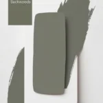
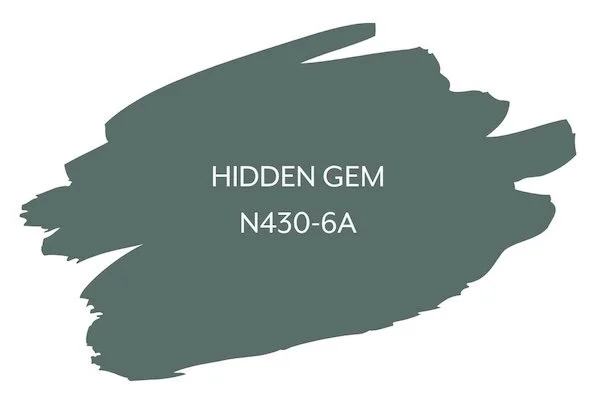
That’s exactly why Behr’s 2026 Color of the Year, Hidden Gem, feels so refreshing.
Because it doesn’t force you to choose between safe and interesting.

Pro Grade Paint Roller Kit, Brush & Roller for Professionals & Homeowners
Perfect for smooth finishes on your interior walls. Ideal for home improvement enthusiasts!
Buy Now on AmazonIt gives you both.
Hidden Gem is one of those rare colors that instantly feels calm and familiar — yet still makes people stop and say,
“Wait… what color is that?”
And that’s the magic.

First Things First: What Does Hidden Gem Actually Look Like?
Hidden Gem is a smoky blue-green with a soft, slightly muted finish.

Rust-Oleum 367605 Home Interior Floor Coating Kit, Semi-Gloss Black
Ideal for updating outdated flooring at a fraction of the cost of replacement and adheres without stripping, sanding or priming.
Buy Now on AmazonNot bright.
Not tropical.
Not loud.
And definitely not boring.
It sits comfortably between blue and green, but never fully commits to either. Some days it leans more blue. Other times, especially in warmer light, it tips gently toward green.
That subtle shift is what makes it feel alive.
It’s moody, but not dark.
Colorful, but not overwhelming.
Calming, but never flat.
Behr describes it as a color that “acts like a new neutral,” and honestly? That description fits perfectly.
Why Hidden Gem Is Being Called a “New Neutral”
For years, neutrals meant beige, gray, or white. That was it.
But people are craving more now.
More warmth. More personality. More feeling.
Hidden Gem fills that gap beautifully.
It works like a neutral — meaning it pairs easily, grounds a space, and doesn’t steal the spotlight — but it brings depth and interest that traditional neutrals simply don’t.
You can use it broadly.
Across multiple rooms.
Even on cabinetry.
And it still feels balanced.
That’s not easy to pull off.
The Emotional Side of Hidden Gem (Yes, That Matters)
Colors affect how we feel. We all know that, even if we don’t talk about it much.
Hidden Gem has a very specific emotional quality.
It feels:
- Calm, without being sleepy
- Grounded, without being heavy
- Creative, without being chaotic
It reminds you of fog rolling over water. Of deep breaths. Of quiet moments that feel restorative.
This is not a color that rushes you.
It slows you down — in a good way.
That’s one of the biggest reasons it’s trending so hard right now.
Let’s Talk Undertones (Because This Is Where People Get Tripped Up)
Hidden Gem’s undertones are what make it special.
At its core, it’s a blue-green, but with a smoky, slightly gray softness layered in. That muted quality keeps it from looking too bright or juvenile.
Depending on lighting, you may notice:
- More blue in cooler or north-facing rooms
- More green in warm light or evening light
- A slightly gray, moody softness in low light
And instead of fighting those shifts, the color embraces them.
It adapts.
Why Behr Chose Hidden Gem as Color of the Year 2026
This pick isn’t random.
Behr’s 2026 Color of the Year reflects a bigger shift in how people want their homes to feel.
Homes are no longer just styled for looks. They’re expected to support our moods, our routines, and our mental well-being.
Hidden Gem speaks directly to that.
It’s:
- Soothing without being dull
- Stylish without being trendy
- Expressive without being exhausting
It allows people to use color again — without fear.
And that’s powerful.
Where Hidden Gem Works Beautifully
This color is incredibly flexible. Let’s walk through some of the best places to use it.
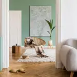
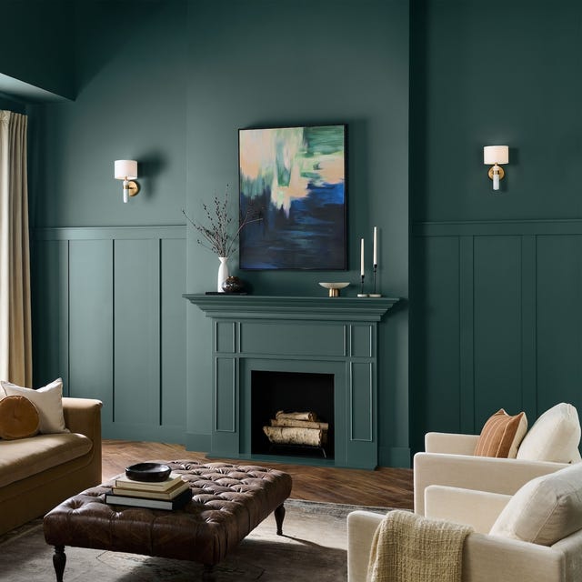
Living Rooms
Hidden Gem makes living rooms feel calm and elevated.
It’s especially beautiful if you want something more interesting than beige or gray, but you still want that relaxed, welcoming vibe.
Pair it with soft whites, warm woods, and cozy textures, and the room instantly feels intentional — not overdesigned.
It’s the kind of living room people actually want to sit in.
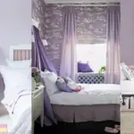
Bedrooms
This is where Hidden Gem truly shines.
Its soft, moody quality makes bedrooms feel serene and cocooning. Not dark. Not cold. Just restful.
It works beautifully with:
- Crisp white bedding
- Linen textures
- Soft grays or warm neutrals
- Minimal, natural décor
If you want a bedroom that helps you unwind instead of stimulating you, this color gets it right.
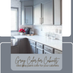
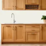
Kitchens and Cabinets
Yes — cabinets.
Hidden Gem is stunning on cabinetry, especially if you’re tired of white kitchens but don’t want something trendy that you’ll regret.
It pairs beautifully with:
- Brass or champagne hardware
- Marble or quartz countertops
- Warm wood shelving
- Soft white walls
It feels modern, but also timeless.
And it doesn’t overpower the space, which is key in kitchens.
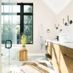
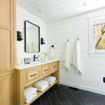
Bathrooms
In bathrooms, Hidden Gem feels spa-like and calming.
Think stone, warm metals, soft lighting, and clean lines. The color instantly elevates the space without trying too hard.
It’s perfect if you want a bathroom that feels like a retreat, not a showroom.
Accent Walls and Statement Areas
If you’re not ready to commit to an entire room, Hidden Gem works beautifully as an accent.
Behind a bed.
In a reading nook.
On built-ins or shelving.
It adds depth and mood without overwhelming the space.
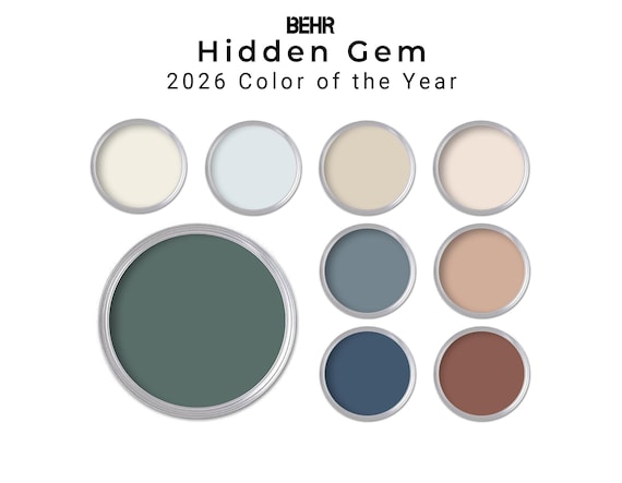
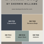
What Colors Pair Well with Hidden Gem?
This is where it really earns its “new neutral” title.
With Whites
Soft, warm whites are ideal.
Avoid anything too icy or stark. You want contrast, but not tension.
With Neutrals
Warm grays, taupes, and soft beiges balance Hidden Gem beautifully and keep the palette grounded.
With Earth Tones
This is one of Hidden Gem’s strongest pairings.
Think:
- Warm woods
- Clay or terracotta accents
- Soft browns
- Muted greens
These combinations feel natural and cohesive.
With Dark Accents
Charcoal, deep navy, or even black accents can add drama without overwhelming the space.
Hidden Gem can handle it.
The Pros (Why People Love Hidden Gem)
- Acts like a neutral but feels more interesting
- Calm and soothing without being boring
- Works on walls, cabinets, and accents
- Adapts beautifully to different lighting
- Feels modern but not trendy
The Cons (Let’s Be Real)
- In very dark rooms, it can feel moody
- If you prefer warm-only colors, the blue tones may not be for you
- Needs thoughtful lighting to really shine
But for most people, these are manageable — not deal-breakers.
How to Make Hidden Gem Look Its Best
Here’s the key advice.
Don’t overcomplicate it.
Let the color breathe.
Pair it with simple, warm materials.
Avoid mixing it with too many competing colors.
And always — always — sample it in your space.
Watch how it changes throughout the day. That’s part of the experience.
Final Thoughts
Behr Hidden Gem isn’t loud.
It doesn’t demand attention.
Instead, it quietly changes how a space feels.
It makes rooms calmer.
More thoughtful.
More lived-in.
If you’re ready to move beyond basic neutrals but still want something timeless and easy to live with, Hidden Gem might be exactly what you’ve been searching for.
It’s proof that color doesn’t have to be scary — it can be grounding, comforting, and beautifully subtle.