Choosing the right paint color can transform an ordinary room into a warm, stylish, and cohesive space. One color that has gained attention among designers and homeowners alike is Sherwin-Williams Felted Wool SW 9171. This rich, earthy neutral has the rare ability to feel both sophisticated and cozy at the same time.
But like many complex neutrals, Felted Wool truly shines when paired with the right coordinating colors. The right combinations can highlight its warmth, soften its depth, or add contrast that elevates an entire interior design palette.
In this guide, we’ll explore the best colors to pair with Felted Wool, how to use them in different rooms, and practical design tips to help you create a beautiful and balanced space.
Understanding Sherwin-Williams Felted Wool (SW 9171)
Before choosing coordinating colors, it’s important to understand the personality of the paint itself.
Sherwin-Williams Felted Wool SW 9171 is a warm, earthy gray-brown often described as a taupe-leaning neutral. Its unique appeal comes from its subtle blend of beige, gray, and green undertones, which give it a grounded and natural appearance.

Pro Grade Paint Roller Kit, Brush & Roller for Professionals & Homeowners
Perfect for smooth finishes on your interior walls. Ideal for home improvement enthusiasts!
Buy Now on AmazonKey characteristics:
- Color family: Warm greige / taupe
- Undertones: Beige and green
- LRV: Around 28 (medium-dark depth)
- Style compatibility: Modern farmhouse, rustic, transitional, and contemporary interiors
Because of its muted complexity, Felted Wool shifts slightly depending on lighting. In natural daylight it leans more gray, while under warm indoor lighting it can appear slightly brown or taupe.
This adaptability makes it a fantastic base color—but also means that the colors you pair with it matter a lot.
Why Color Pairing Matters
When decorating with a rich neutral like Felted Wool, coordinating colors serve several purposes:

Rust-Oleum 367605 Home Interior Floor Coating Kit, Semi-Gloss Black
Ideal for updating outdated flooring at a fraction of the cost of replacement and adheres without stripping, sanding or priming.
Buy Now on Amazon- Balance – Prevent the room from feeling too dark
- Contrast – Highlight architectural details
- Harmony – Maintain a cohesive palette
- Mood control – Adjust warmth or coolness in the space
The best palettes usually combine:
- A light contrast color
- A mid-tone neutral
- A bold accent color
Let’s explore the best options.
1. Soft Creamy Whites (The Perfect Trim Pairing)
One of the most beautiful pairings with Felted Wool is a warm creamy white.
A standout option is
Sherwin-Williams Shoji White SW 7042
Shoji White is a soft off-white with warm undertones that complements the earthy depth of Felted Wool beautifully. It adds brightness without creating a harsh contrast.
Why it works
- Balances the darker depth of Felted Wool
- Enhances the warm undertones
- Creates a cozy yet sophisticated contrast
Best uses
- Trim and baseboards
- Kitchen cabinets
- Ceilings
- Interior doors
Design tip
If you’re painting walls in Felted Wool, using Shoji White for trim creates a classic designer look that feels clean but not overly stark.
2. Warm Neutral Grays
Layering neutrals is one of the easiest ways to create a cohesive palette.
Some excellent gray pairings include:
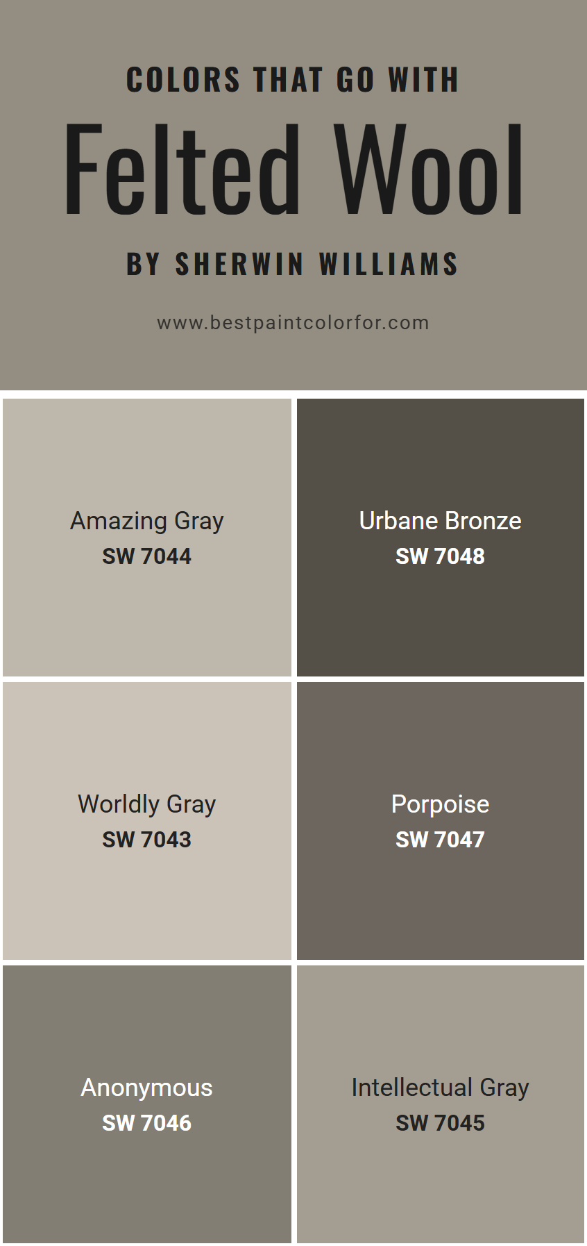
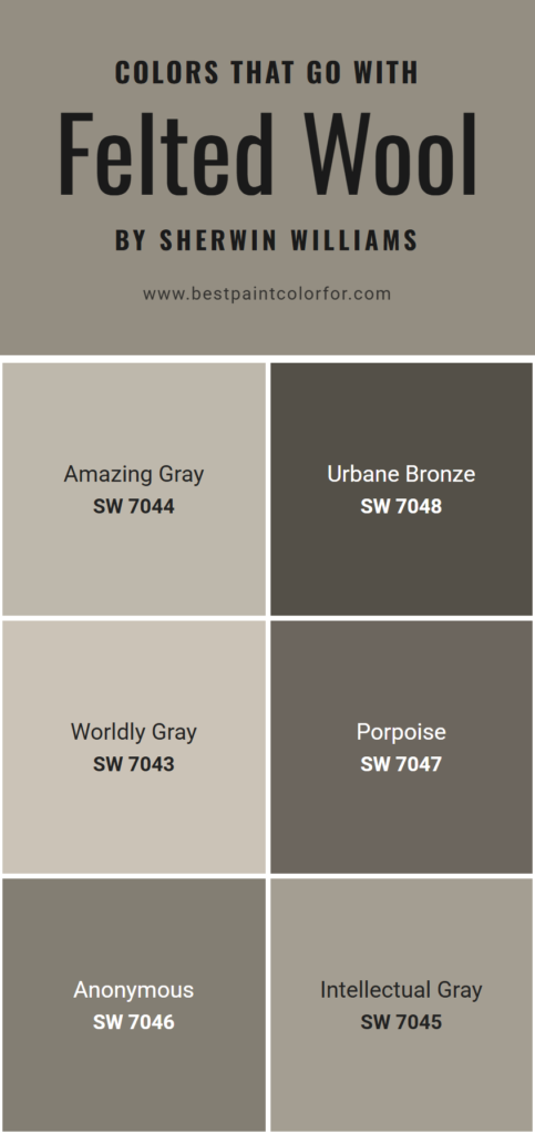
- Sherwin-Williams Amazing Gray SW 7044
- Sherwin-Williams Worldly Gray SW 7043
- Sherwin-Williams Skyline Steel SW 1015
These colors share similar undertones with Felted Wool, creating a seamless and elegant color flow throughout a home.
Where they work best
- Open-concept homes
- Hallways and adjoining rooms
- Living rooms and dining areas
Example palette
- Walls: Felted Wool
- Adjacent room: Worldly Gray
- Trim: Shoji White
This combination creates a sophisticated layered neutral scheme.
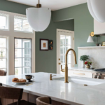
3. Deep Earthy Greens
Because Felted Wool already has subtle green undertones, earthy greens create a naturally harmonious palette.
A beautiful example is:
Sherwin-Williams Foxhall Green SW 9184
Foxhall Green is a rich, deep green that enhances the natural warmth of Felted Wool and adds a luxurious feel to interiors.
Best uses
- Accent walls
- Cabinets
- Built-in shelves
- Interior doors
Design effect
Pairing these two colors together creates a nature-inspired palette that feels calm, grounded, and elegant.
4. Moody Blue-Gray Accents
If you want contrast, blue-gray shades provide a beautiful complement.
One strong pairing is:
Sherwin-Williams Storm Cloud SW 6249
Storm Cloud is a deep gray-blue that contrasts with the warm tones of Felted Wool while still maintaining a balanced palette.
Other great blue accents include:
- Sherwin-Williams Let It Rain SW 9152
- Sherwin-Williams Granite Peak SW 6250
Why blue works well
- Blue sits opposite warm taupes on the color wheel
- Adds depth and contrast
- Keeps the palette from feeling overly warm
5. Dramatic Dark Accents
If you love bold interiors, pairing Felted Wool with darker colors can create a dramatic and upscale atmosphere.
A top choice is:
Sherwin-Williams Urbane Bronze SW 7048
Urbane Bronze is a deep bronze-brown that adds depth and modern sophistication to a Felted Wool palette.
Perfect for
- Kitchen islands
- Fireplace surrounds
- Accent walls
- Exterior trim
Design vibe
This combination works especially well in modern farmhouse and luxury rustic interiors.
6. Soft Bright Whites for Contrast
If you want a fresher and brighter contrast, crisp whites can work beautifully.
Consider:
- Sherwin-Williams Snowbound SW 7004
- Sherwin-Williams Alabaster SW 7008
These whites lighten the palette and prevent the room from feeling heavy.
Best rooms
- Kitchens
- Bathrooms
- Small spaces
- Hallways
Example Color Palette Using Felted Wool
Here’s a designer-approved palette that works beautifully in many homes:
Main wall color
• Felted Wool SW 9171
Trim and ceiling
• Shoji White SW 7042
Accent color
• Foxhall Green SW 9184
Secondary neutral
• Worldly Gray SW 7043
Bold contrast
• Urbane Bronze SW 7048
This layered palette balances warm neutrals, natural greens, and dramatic depth.
Best Rooms to Use Felted Wool
Living Rooms
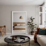
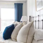
Felted Wool creates a cozy, grounded atmosphere that works beautifully with warm woods, leather furniture, and natural textures.
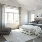
Bedrooms
Because of its calming undertones, it creates a relaxing and sophisticated bedroom environment.
Dining Rooms
The darker depth adds elegance and intimacy to dining spaces.
Home Offices
Its muted tone helps reduce visual distraction while maintaining a stylish backdrop.
Lighting Tips When Using Felted Wool
Because Felted Wool is a mid-dark color, lighting can dramatically affect how it appears.
Best lighting conditions:
- North-facing rooms maintain its balanced tone
- Warm lighting highlights the taupe warmth
- Cool LED lighting brings out more gray tones
If using Felted Wool in a darker room, balance it with lighter trim or furniture to avoid a heavy look.
Decorating Tips for Felted Wool Interiors
To get the most out of this color, consider pairing it with natural materials:
Great material pairings include:
- Light oak wood floors
- Brass or bronze hardware
- Linen and textured fabrics
- Marble countertops
- Leather furniture
These materials enhance the earthy elegance of Felted Wool.
Final Thoughts
Sherwin-Williams Felted Wool SW 9171 is a beautifully balanced neutral that works across many design styles. Its subtle mix of gray, beige, and green undertones makes it incredibly versatile and easy to coordinate with other colors.
Whether you prefer a warm neutral palette, dramatic contrasts, or earthy nature-inspired tones, Felted Wool provides a strong foundation for stunning interior design.
Best color pairings include:
- Shoji White
- Worldly Gray
- Foxhall Green
- Storm Cloud
- Urbane Bronze
- Alabaster
By thoughtfully layering these colors, you can create a home that feels sophisticated, inviting, and timeless.