Choosing paint colors for an open floor plan is like composing a symphony — every note (or in this case, wall) must harmonize while allowing certain instruments to shine. If you’ve ever stood in the middle of a great room wondering how to make your living room, dining room, and kitchen all feel connected—but not identical—you’re not alone.
In traditional homes, each room is its own world. In open-concept living, there are no clear-cut boundaries. That means your paint colors need to flow smoothly, define spaces subtly, and still reflect your personal style. Sounds like a tall order? Don’t worry. In this guide, I’ll walk you through exactly how to make that happen — with expert-approved colors, layout tips, finish tricks, and room-by-room strategies.
Whether you’re repainting your entire home or just starting with a blank canvas, this guide will help you make color choices that are cohesive, beautiful, and make your open space feel like home.
Premium Download
Get the Pro Color Palette for Free
- Help you Visualize
- Help you Plan
- Make most out of it
Understanding Open Floor Plans
What Is an Open Floor Plan?
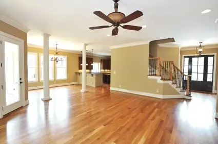
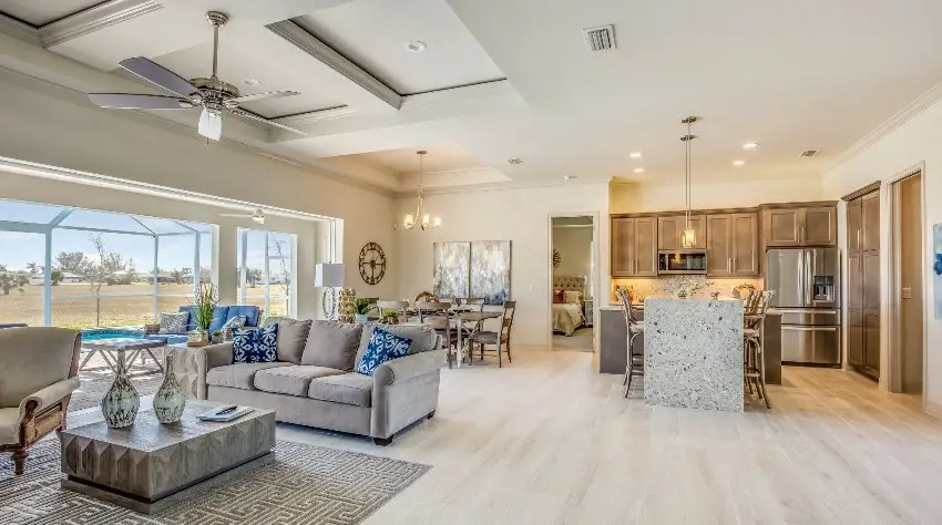
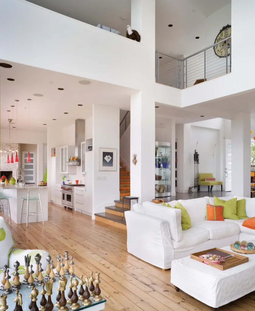
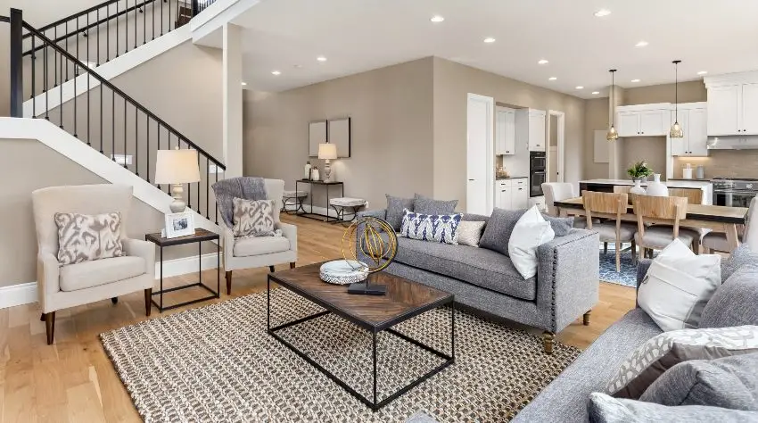
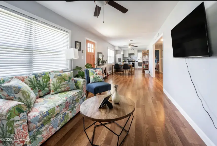
An open floor plan removes traditional barriers like walls and doors between commonly used rooms. You’ll usually see the kitchen, living room, and dining area combined into one large space, often with only partial divisions or none at all.

Pro Grade Paint Roller Kit, Brush & Roller for Professionals & Homeowners
Perfect for smooth finishes on your interior walls. Ideal for home improvement enthusiasts!
Buy Now on Amazon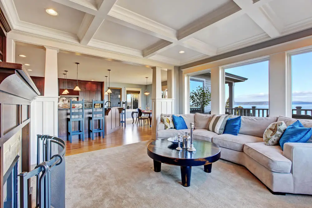
Why Open Floor Plans Are Popular
Open floor plans feel bright, airy, and modern. They encourage interaction, allow more natural light, and are great for families or anyone who loves entertaining. But that openness also means that your paint color choices are on full display — everywhere.
The Challenge of Choosing Paint for Open Spaces
Why It’s Trickier
In traditional layouts, color changes can be hidden behind doors or corners. Not so in open-concept homes. Any abrupt change can look jarring if the transition isn’t well-planned. That’s why color flow is the secret sauce of good open-plan design.
Common Mistakes
- Using the same exact color everywhere can feel bland or monotonous.
- Choosing clashing tones disrupts visual harmony.
- Ignoring undertones means you might pair colors that technically “match” but look off in real life.
Core Principles of Color Flow in Open Spaces
Visual Cohesion vs. Defined Zones
The goal isn’t uniformity — it’s harmony. Think of each area as a scene in the same movie. They can have their own character, but they must belong together.
The 60-30-10 Rule
Designers swear by this formula:

Rust-Oleum 367605 Home Interior Floor Coating Kit, Semi-Gloss Black
Ideal for updating outdated flooring at a fraction of the cost of replacement and adheres without stripping, sanding or priming.
Buy Now on Amazon- 60% main color (walls or largest areas)
- 30% secondary color (furniture or cabinetry)
- 10% accent (pillows, artwork, small walls)
Use it across your entire open space for balance.
Color Temperature and Undertones
Cool tones (like blues and grays) tend to calm, while warm tones (like beiges and yellows) energize. Make sure your selected hues have compatible undertones — mixing a pinky beige with a greenish gray, for example, can feel “off.”
How Lighting Impacts Color in Open Plans
Natural Light
Colors shift with the sun. North-facing rooms tend to cool down colors, while south-facing ones bring out warmth. Always swatch and observe your paint in morning, midday, and evening light.
Artificial Lighting
LEDs, warm bulbs, and even your under-cabinet kitchen lights can dramatically alter how paint looks. Use bulbs similar to what you plan to keep in your home when testing.
How to Test Paint Samples
- Paint large swatches — at least 2′ x 2′ — on multiple walls.
- Check them at different times of day.
- Avoid painting swatches next to each other unless comparing them directly.
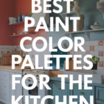
Top Paint Color Families That Work Beautifully
1. Neutral Foundations
Neutrals are open-floor-plan heroes. Think soft greige, warm taupe, or creamy beige.
- Benjamin Moore Edgecomb Gray – a warm greige that adapts beautifully to light.
- Sherwin-Williams Alabaster – a creamy white that doesn’t go yellow.
2. Whites with Personality
A good white adds light without looking sterile.
- Chantilly Lace (BM) – crisp and clean, works for modern homes.
- Simply White (BM) – a touch warmer, more livable.
3. Earthy Tones
Add a sense of comfort and groundedness.
- Soft clays and mushroom browns warm up industrial or modern spaces.
- Sherwin-Williams Shiitake – understated and cozy.
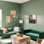
4. Greens That Connect
Green is having a moment. Sage, olive, and eucalyptus add natural calm.
- Clare Paint’s Dirty Martini or Sherwin-Williams Evergreen Fog – trendy yet timeless.
5. Blues That Flow
Blues work well in kitchens and family rooms.
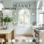
- Try Benjamin Moore Palladian Blue or Sherwin-Williams Sea Salt for that breezy, coastal touch.
6. Grays with Depth
Grays can either feel cold or sophisticated. Choose wisely.
- SW Agreeable Gray and BM Revere Pewter are legendary for a reason.
Color Placement Tips for Seamless Flow
Main Color
Use your main color on the largest visual areas: the living room walls, hallways, and kitchen.
Secondary Colors
Introduce these where the layout shifts — like on a kitchen island or dining room niche.
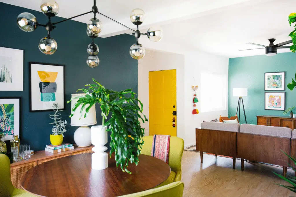
Zoning with Color Blocking
Create subtle visual boundaries by slightly deepening or lightening the same hue in different areas.
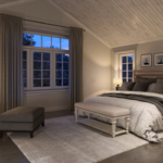
Room-by-Room Paint Color Coordination
Living Room + Dining Room
If they share a wall, consider using the same main color for both. Then add character with artwork, curtains, or area rugs.
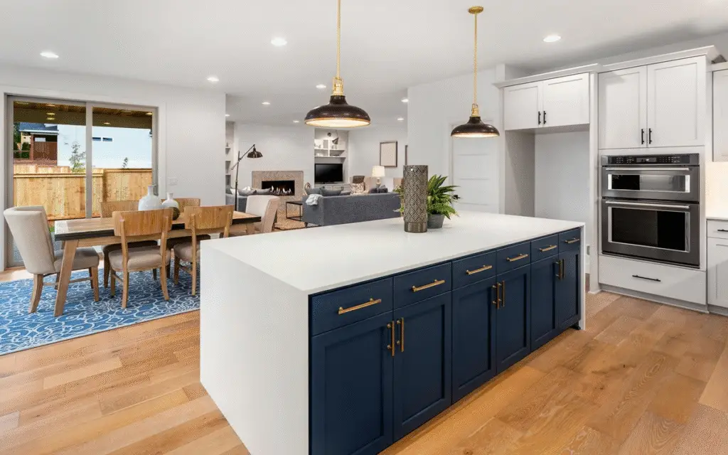
Kitchen & Islands
Use contrast wisely. A navy island with white cabinetry and soft beige walls? Gorgeous.
Hallways & Transitions
Use the same base as your main space or go one tone lighter for smooth continuity.
Office Nooks
Add slightly bolder colors here to energize — deep blue, forest green, or even charcoal.
How to Use Accent Colors Without Breaking Flow
Best Spots for Accents
- Inside niches
- On interior doors
- Kitchen islands
- Fireplace walls
Trendy Accent Colors in 2025
- Inky Blue
- Moody Charcoal
- Muted Mustard
- Forest Green
Best Two-Color and Three-Color Combinations
Foolproof Duos
- Edgecomb Gray + Simply White
- Alabaster + Evergreen Fog
Expert Triads
- Pale Oak + Hale Navy + White Dove
- Repose Gray + Sea Salt + Urbane Bronze
Use the boldest color in the smallest quantity (10% rule).
Ceiling and Trim Considerations
Ceiling Color
You can use the wall color on ceilings in modern homes. But classic white still helps bounce light.
Trim Color
Crisp white trim (like BM’s Decorator’s White) provides contrast and clean lines. Or go tonal for a softer look.
Paint Finishes Matter Too
- Matte or Flat: Hides flaws, great for ceilings and low-traffic areas.
- Eggshell: A go-to for walls — low sheen but wipeable.
- Satin: Durable, good for kitchens and bathrooms.
- Semi-gloss: Trim, baseboards, and doors.
Keep the finish consistent across open spaces unless function demands otherwise.
Color Psychology and Mood
- Blues & Greens calm and soothe — great for large open living spaces.
- Warm tones like terracotta and golden beige feel inviting.
- Gray tones create a neutral, upscale backdrop.
Match your palette with how you want your space to feel.
Real-Life Paint Color Combos That Work
- BM Edgecomb Gray + White Dove Trim: Classic, elegant, adaptable.
- SW Repose Gray + Sea Salt + Urbane Bronze Accents: Cool and modern.
- BM Pale Oak + Hale Navy Island + Simply White Cabinets: Balanced and bold.
These combinations work in real homes and have been tested by designers time and time again.
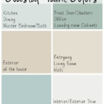
How to Create a Whole-House Color Palette
Step 1: Start with a Main Color
Pick one neutral that you love and use it in the largest areas.
Step 2: Choose 2–3 Supporting Colors
These can vary in depth but should share undertones.
Step 3: Add One Accent or Bold Pop
Use it sparingly — a little goes a long way.
Mistakes to Avoid
- Picking colors based solely on paint chips
- Choosing trendy colors without testing them in your light
- Using too many dark tones in poorly lit areas
- Ignoring ceiling and trim contrast
FAQs
Can I use the same color throughout the whole house?
Yes — with variation! Use different finishes or shades (lighter/darker) to add interest.
What if I want each space to feel unique?
Use color zoning, furniture, and lighting to define areas, not just wall color.
How do I transition between paint colors?
Use natural architectural breaks or subtle shifts in saturation within the same palette.
Expert Tips for Flawless Results
- Use a sample board to test paint, not just swatches.
- Paint two coats during testing — some colors need depth.
- Check colors in natural and artificial light.
- Choose a color that connects to your stuff — rugs, furniture, countertops.
Best Paint Brands for Open Concept Homes
- Sherwin-Williams: Rich tones, designer-favorite.
- Benjamin Moore: Unmatched neutrals, top-tier quality.
- Behr: Budget-friendly with great coverage.
- Clare: Curated designer palettes, no guesswork.
- Lick Paint: Eco-friendly and trendy.
Conclusion
Designing an open floor plan that flows with color isn’t about following rules — it’s about creating harmony. With the right palette, your home will feel connected, spacious, and inviting.
Take your time. Sample generously. And don’t be afraid to add a little personality — after all, your home should reflect you.
Join the Conversation
Tried one of these combos in your own open floor plan? Share your experience in the comments — I’d love to hear what worked for you! And if you found this guide helpful, don’t forget to pin it or share it with a friend tackling their next home refresh.