Are you searching for a stunning mid-toned blue paint color to bring life and tranquility to your home? Look no further than Sherwin Williams Tidewater (SW 6477). This captivating shade combines the calmness of blue with warm green undertones, creating a versatile hue perfect for a variety of spaces and styles. Let’s dive into everything you need to know about Tidewater and how to use it to its fullest potential.
- Why Choose a Mid-Toned Blue?
- Exploring the Versatile Charm of Sherwin Williams Tidewater
- Why Tidewater Works Across Styles
- Technical Details of Sherwin Williams Tidewater
- How Does Tidewater Look in Different Lighting?
- Best Uses for Sherwin Williams Tidewater
- Similar Colors to Consider
- FAQs About Sherwin Williams Tidewater
- How to Get Started with Tidewater
- Why Choose Tidewater?

Why Choose a Mid-Toned Blue?
Blue hues are incredibly popular in interior design right now, and for good reason. A mid-toned blue with hints of green, like Tidewater, adds a cozy, inviting vibe while maintaining a refreshing energy. This color is ideal for creating a soothing atmosphere reminiscent of coastal living—perfect for anyone looking to bring a vacation-like tranquility into their home.
Exploring the Versatile Charm of Sherwin Williams Tidewater
Color Characteristics
Sherwin Williams Tidewater (SW 6477) is a harmonious blend of blue and green that exudes a light, breezy vibe. This versatile shade is celebrated for its ability to transform spaces with its unique warm green undertones, making it a favorite across various design styles. Here’s a closer look at how Tidewater adapts to popular aesthetics:
1. Coastal and Beachy Styles
Tidewater’s soft, airy hue makes it a natural choice for coastal and beach-inspired interiors. Its light blue tone mirrors the calming expanse of the ocean, while the subtle green undertones evoke images of tranquil seafoam. This combination brings an unparalleled sense of serenity and freshness to a space.
In beachy homes, Tidewater works wonders on walls, cabinetry, or even as a statement piece on furniture. Pair it with sandy beige tones, creamy whites, and natural textures like rattan or driftwood for an authentic coastal retreat. Imagine waking up in a Tidewater-painted bedroom with sunlight streaming through sheer curtains—it’s like a seaside getaway every day.

Pro Grade Paint Roller Kit, Brush & Roller for Professionals & Homeowners
Perfect for smooth finishes on your interior walls. Ideal for home improvement enthusiasts!
Buy Now on Amazon2. Farmhouse Themes
Farmhouse decor thrives on a balance of rustic charm and modern sophistication, and Tidewater strikes the perfect chord. Its gentle warmth adds a modern twist to traditional farmhouse palettes while maintaining the inviting, down-to-earth aesthetic the style is known for.
In a farmhouse kitchen, Tidewater-painted cabinets paired with butcher block countertops and aged bronze hardware can create a warm yet fresh atmosphere. For living rooms, consider using Tidewater on accent walls to bring color without overwhelming the space, and complement it with off-whites, soft grays, and weathered wood finishes.
3. Bold, Eclectic Spaces
Tidewater’s adaptable nature also makes it a surprising choice for bold and eclectic interiors. Its mid-tone balance between blue and green can anchor a space filled with vibrant, mismatched elements while still providing an energizing pop of color.
For a daring look, combine Tidewater with rich jewel tones like emerald green, navy, or mustard yellow. Incorporate unique textures, geometric patterns, or statement artwork to bring an eclectic space to life. Tidewater serves as a grounding force in these dynamic settings, creating harmony amidst the boldness.

Rust-Oleum 367605 Home Interior Floor Coating Kit, Semi-Gloss Black
Ideal for updating outdated flooring at a fraction of the cost of replacement and adheres without stripping, sanding or priming.
Buy Now on AmazonWhy Tidewater Works Across Styles
The true beauty of Tidewater lies in its chameleon-like quality. Its warm undertones make it versatile, as it takes on different characteristics based on lighting and surrounding colors. In sunlit rooms, it appears warmer and greener, enhancing its connection to nature. In dimmer, north-facing spaces, it leans cooler and bluer, lending a sophisticated tranquility.
Sherwin Williams Tidewater isn’t just a color; it’s an experience. Whether you’re curating a cozy beach house, refreshing a modern farmhouse, or designing a bold and eclectic space, this hue has the ability to seamlessly blend and elevate your aesthetic.
Technical Details of Sherwin Williams Tidewater
Understanding the technical aspects of Sherwin Williams Tidewater (SW 6477) can help you decide whether it’s the right choice for your space. Let’s break down the key details:
1. Color Family: Blue
Tidewater is firmly rooted in the blue family, but its warm green undertones set it apart. While it reads as a soft and airy blue at first glance, the subtle infusion of green adds depth and versatility. This blend allows Tidewater to complement a variety of color schemes, making it suitable for both cool and warm-toned decor.
2. Light Reflectance Value (LRV): 65
The Light Reflectance Value (LRV) is an essential metric for choosing paint colors. It measures how much light a color reflects on a scale of 0 (pure black) to 100 (pure white). Tidewater’s LRV of 65 places it in the “light medium” category, offering a perfect balance between brightness and depth.
- Why LRV Matters:
- Bright Spaces: In rooms with ample natural light, Tidewater reflects light beautifully, creating an open and airy feel.
- Dim Spaces: Its moderate LRV prevents it from feeling too dark in rooms with limited light while maintaining a cozy ambiance.
- Whole-House Paint: With its well-balanced reflectiveness, Tidewater is an excellent candidate for a cohesive look throughout the home.
3. RGB Code: R: 195, G: 215, B: 211
The RGB code specifies the precise proportions of red (R), green (G), and blue (B) that make up Tidewater:
- Red (R): 195
- Green (G): 215
- Blue (B): 211
These values indicate that Tidewater is predominantly blue and green, with a slight reduction in red. This unique balance is what gives Tidewater its fresh, clean appearance and warm undertones. The higher green and blue values make it a calming and serene shade, perfect for spaces where relaxation is key.
4. Hex Code: #C3D7D3
The hexadecimal code #C3D7D3 translates Tidewater’s RGB values into a digital format, making it ideal for use in design software, virtual renderings, or online color matching tools. This code ensures precision when coordinating Tidewater with other design elements, such as trim, furniture, or decor.
Why These Details Matter
The technical specifications of Tidewater—its color family, LRV, RGB values, and hex code—are more than just numbers. They provide valuable insights into how the color behaves in different settings:
- Lighting Influence: The LRV and RGB values explain why Tidewater shifts its appearance depending on natural or artificial light. In brighter spaces, its warm green undertones emerge, while dimmer rooms emphasize its cooler blue qualities.
- Design Versatility: The blue base and green undertones make Tidewater adaptable to a range of design styles, from coastal and farmhouse to contemporary and eclectic.
- Color Matching: The hex code and RGB values make it easy to coordinate Tidewater with other hues digitally, ensuring a harmonious palette for your home.
By understanding these details, you can make an informed decision and fully utilize Tidewater’s potential to create a harmonious and beautiful living space.
How Does Tidewater Look in Different Lighting?
One of the most captivating aspects of Sherwin Williams Tidewater (SW 6477) is its ability to transform its appearance depending on the lighting conditions. This chameleon-like quality makes it a dynamic choice, adding layers of visual interest to your space. Let’s explore how Tidewater behaves in various lighting scenarios:
1. South-Facing Rooms
South-facing rooms are known for their abundant, warm natural light throughout the day. This lighting tends to intensify Tidewater’s warm green undertones, creating a vibrant, cheerful ambiance.
- Effect: In these rooms, Tidewater takes on a lively, almost tropical appearance, with its green undertones becoming more pronounced. The result is a color that feels fresh, inviting, and full of life.
- Best Use: Ideal for spaces like living rooms or kitchens where you want to create a welcoming and energized atmosphere. Pair it with crisp white trim or light, natural wood finishes to enhance its brightness.
2. North-Facing Rooms
North-facing rooms receive cooler, softer natural light, which tends to highlight Tidewater’s blue base while subduing its green undertones.
- Effect: In these spaces, Tidewater appears more tranquil, serene, and slightly muted. The cooler light gives the color a soothing, spa-like quality, perfect for fostering relaxation.
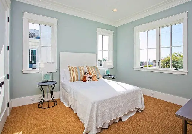
- Best Use: This makes Tidewater an excellent choice for bedrooms, bathrooms, or home offices where a calming environment is desired. Pair it with warm, creamy whites or beige accents to balance its cooler tones.
3. Artificial Lighting
Artificial lighting can also impact Tidewater’s appearance:
- Warm Lighting (Yellow or Soft White Bulbs): Enhances the green undertones, making the space feel cozy and inviting.
- Cool Lighting (Daylight or Cool White Bulbs): Brings out Tidewater’s blue hues, resulting in a crisp and refreshing effect.
- Best Practice: Experiment with different light temperatures to see how Tidewater reacts in your specific space.
Pro Tip: Test Before You Commit
Lighting plays a crucial role in how any paint color looks, and Tidewater is no exception. Always test colors in your space before making a final decision. Here’s how:
- Use peel-and-stick samples or paint small swatches on your walls to observe how Tidewater changes under different lighting conditions.
- Check the color at various times of the day to see its full range of tones.
By testing beforehand, you can ensure Tidewater complements your room’s natural and artificial lighting perfectly.
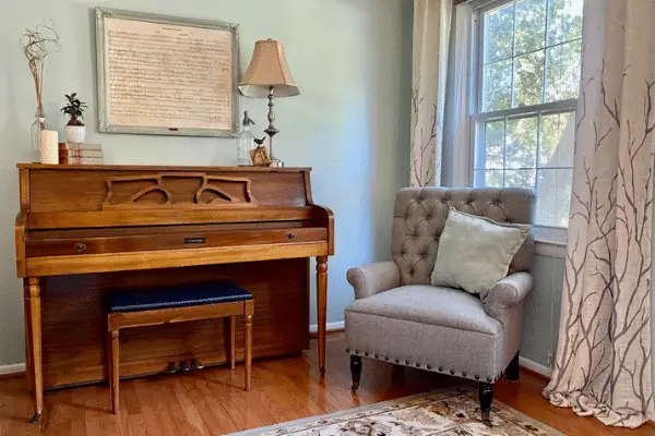
Best Uses for Sherwin Williams Tidewater
Tidewater’s versatility allows it to shine in various applications, from walls and cabinetry to furniture and exterior surfaces. Here are some of the best ways to incorporate this stunning color into your home:
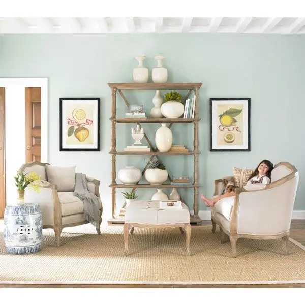
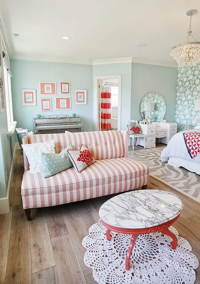
1. Living Rooms
Tidewater is perfect for creating a welcoming and serene living room. Its balanced tones bring a sense of calm without feeling too cold or overly bold.
- Style Pairings: Combine with neutral furniture, natural textiles, and light wood accents for a relaxed, coastal-inspired space. Add pops of navy or coral for a more dynamic, layered look.
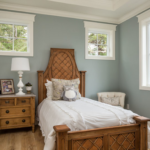
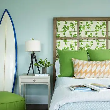
2. Bedrooms
Transform your bedroom into a restful sanctuary with Tidewater. Its soothing blue and green tones promote relaxation and tranquility, ideal for winding down at the end of the day.
- Style Pairings: Pair with soft white bedding, pale gray accents, and muted metallics like brushed gold or silver to create a chic yet peaceful retreat.
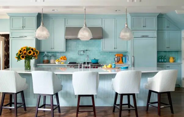
3. Kitchens
Tidewater’s fresh and clean aesthetic makes it a standout choice for kitchens. Use it on walls, cabinetry, or even a kitchen island to add a hint of personality and coastal charm.
- Style Pairings: Accent with polished nickel hardware, white marble countertops, and subway tiles to maintain a timeless, elegant feel.
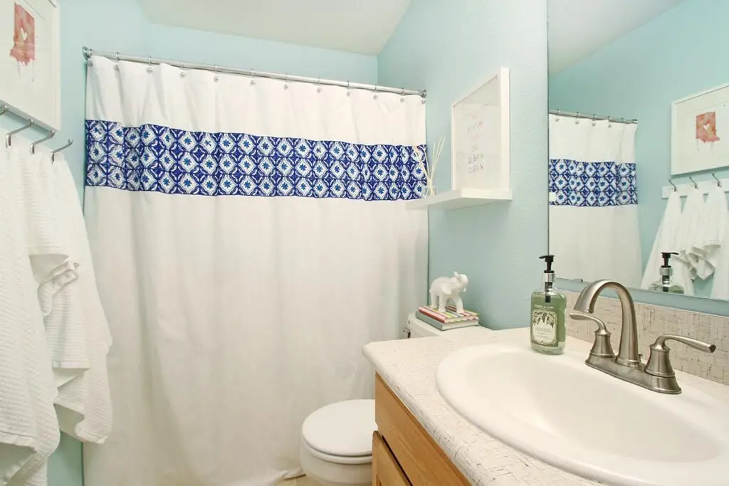
4. Bathrooms
Bring the tranquility of a spa into your bathroom with Tidewater. Its serene tones evoke the calm of ocean waves, making it perfect for a relaxing retreat.
- Style Pairings: Pair with crisp white tiles, light wood vanities, and soft aqua or teal accessories for a cohesive, soothing look.
5. Home Exteriors
Tidewater is a fantastic choice for brightening up your home’s curb appeal. Its soft, coastal hue adds a welcoming touch to exterior siding, shutters, or even front doors.
- Style Pairings: Combine with white trim, stone accents, or deep navy shutters for a sophisticated, beachy vibe.

6. Interior Doors and Furniture
For a subtle but impactful statement, consider using Tidewater on interior doors or furniture pieces. It’s a creative way to introduce a pop of color without overwhelming the space.
- Style Pairings: Use Tidewater on a coffee table, dresser, or entryway bench. Pair with neutral walls and metallic decor to create a balanced yet stylish look.
7. Whole-House Paint Color
Tidewater’s moderate Light Reflectance Value (LRV) and balanced tones make it an excellent candidate for a cohesive, whole-house paint scheme.
- Style Pairings: Use Tidewater on the walls throughout your home and accent it with creamy whites for trim and ceilings. Incorporate complementary shades, like soft beiges or deep navy, to add visual interest in different rooms.
With its versatility and ability to adapt to various lighting conditions, Sherwin Williams Tidewater is a top contender for adding personality and tranquility to your home. Whether used sparingly or throughout your entire space, this stunning shade is sure to create an inviting and harmonious environment.
Similar Colors to Consider
If you love Sherwin Williams Tidewater (SW 6477) but want to explore other options with slightly different undertones or characteristics, here are some excellent alternatives to consider. Each of these shades offers its own unique charm while maintaining a similar tranquil and coastal-inspired vibe.
1. Benjamin Moore Annapolis Green
- Description: Annapolis Green is a slightly greener counterpart to Tidewater, offering a fresh and natural aesthetic. It leans toward the green side of the spectrum but still carries enough blue to maintain a coastal feel.
- Best For: Spaces where you want a touch more warmth and earthiness. Works beautifully in bathrooms, kitchens, or accent walls.

2. Behr Rain Washed
- Description: Behr Rain Washed is a softer, more muted variation of Tidewater. Its delicate tone creates an understated, serene backdrop.
- Best For: Bedrooms or spaces where you want a whisper of color without overwhelming the room. It pairs well with neutral tones and light woods.
3. Sherwin Williams Waterscape
- Description: Waterscape leans greener than Tidewater, with just a hint of blue. This color evokes the calm of a tropical lagoon and is ideal for spaces that require a soothing and balanced look.
- Best For: Living rooms, bathrooms, or exteriors where you want a natural yet fresh appearance.

4. Sherwin Williams Open Air
- Description: Open Air is a lighter, breezier option compared to Tidewater. It emphasizes the blue tones while remaining soft and ethereal.
- Best For: Smaller spaces, ceilings, or rooms where you want to maximize light and create an airy atmosphere.

FAQs About Sherwin Williams Tidewater
To help you make the most informed decision about Tidewater, here are answers to some common questions about this popular shade:
1. Is Tidewater more blue or green?
Tidewater is predominantly blue with warm green undertones.
- Bright Spaces: In well-lit areas, the green undertones become more pronounced, giving it a fresh, lively appearance.
- Dim Lighting: The blue base dominates, resulting in a cooler and more subdued tone.
2. How does Tidewater compare to Sea Salt?
- Tidewater: Leans more toward blue, offering a vibrant yet tranquil pop of color.
- Sea Salt: Leans greener with gray undertones, making it more muted and neutral.
- Best Use: Choose Tidewater for spaces that need energy and freshness, and Sea Salt for more subdued, earthy spaces.
3. Is Tidewater good for kitchen cabinets?
Absolutely! Tidewater’s cheerful and uplifting tone makes it an excellent choice for kitchen cabinetry.
- Lighting Consideration: Test it in your kitchen first to ensure it complements your lighting and countertops.
- Pairings: Combine with white or cream countertops and brushed nickel hardware for a clean, modern look.
4. How does Tidewater compare to Tradewind?
- Tradewind: Has more gray undertones, making it a softer and more muted blue.
- Tidewater: Is brighter, with a more turquoise-like vibrancy.
- Best Use: Choose Tradewind for a subdued, coastal feel and Tidewater for a lively, fresh statement.
How to Get Started with Tidewater
If you’re ready to bring the beauty of Tidewater into your home, here’s a step-by-step guide to ensure success:
1. Swatch It
Before committing, test Tidewater in your space using removable peel-and-stick samples or by painting small sections of your walls.
- Observe how it looks under different lighting conditions—natural light, artificial light, and during different times of the day.
2. Plan Your Palette
Create a cohesive color scheme by selecting complementary colors for trim, furniture, and adjacent rooms.
- Suggestions: Pair Tidewater with crisp whites like Sherwin Williams Extra White (SW 7006) or soft neutrals like Accessible Beige (SW 7036).
3. Get Expert Help
To streamline the process, download a free paint color planning worksheet. This tool helps you:
- Evaluate your room’s features (lighting, size, and existing elements).
- Plan accent colors and overall design themes.
Why Choose Tidewater?
Sherwin Williams Tidewater isn’t just a color—it’s an experience. This serene and versatile shade brings a slice of coastal paradise into your home. Whether you’re looking to add a fresh pop of color to a single room or create a cohesive aesthetic throughout your space, Tidewater delivers charm, tranquility, and sophistication.
Let Tidewater transform your home into a serene oasis, where every day feels like a calming retreat by the ocean. 🌊