Today, I’m going to share with you the truth about beige paint colors and why they’re so hard to get right. There are five undertones that everyone should know. So what I’m going to do is break down these five different undertones in the world of beiges. I’ve selected just a few paint colors, but I’ve also selected a contrasting paint color that’s going to pull out these undertones so that you can see them yourself.
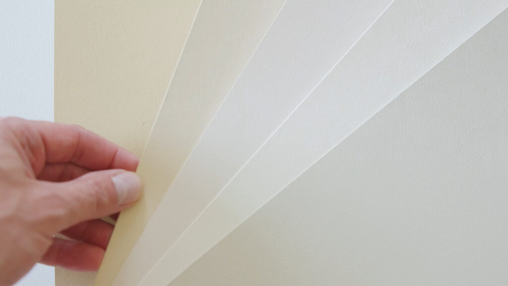
I’m also going to talk about the importance of comparing these beige paint colors with your fixed elements, and why lighting is going to play a big role in how these paint colors could look in your home. Towards the end of this blog, I’m going to let you know which undertone in the beige family is trending today.
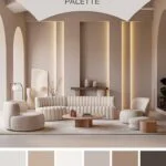
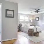
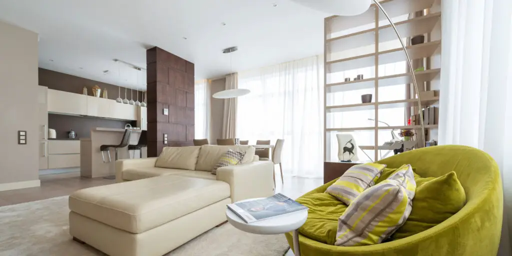
Why Choose Beige?
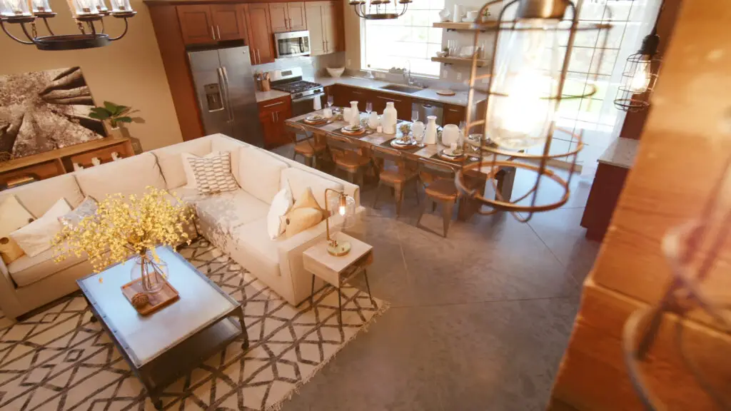
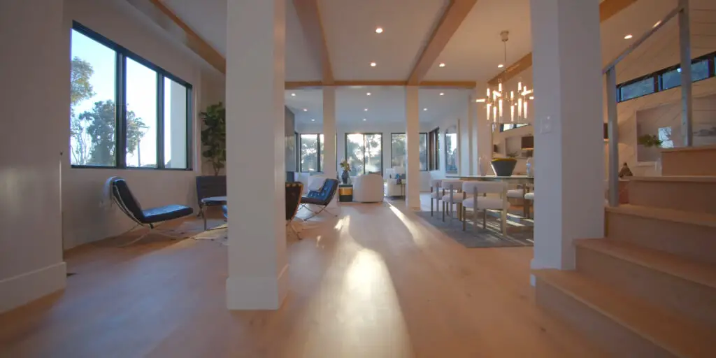
Beige is timeless and incredibly versatile. It creates a warm and peaceful atmosphere in any room. While some designers might feel it’s overused, for many homeowners, beige feels safe, familiar, and comforting.
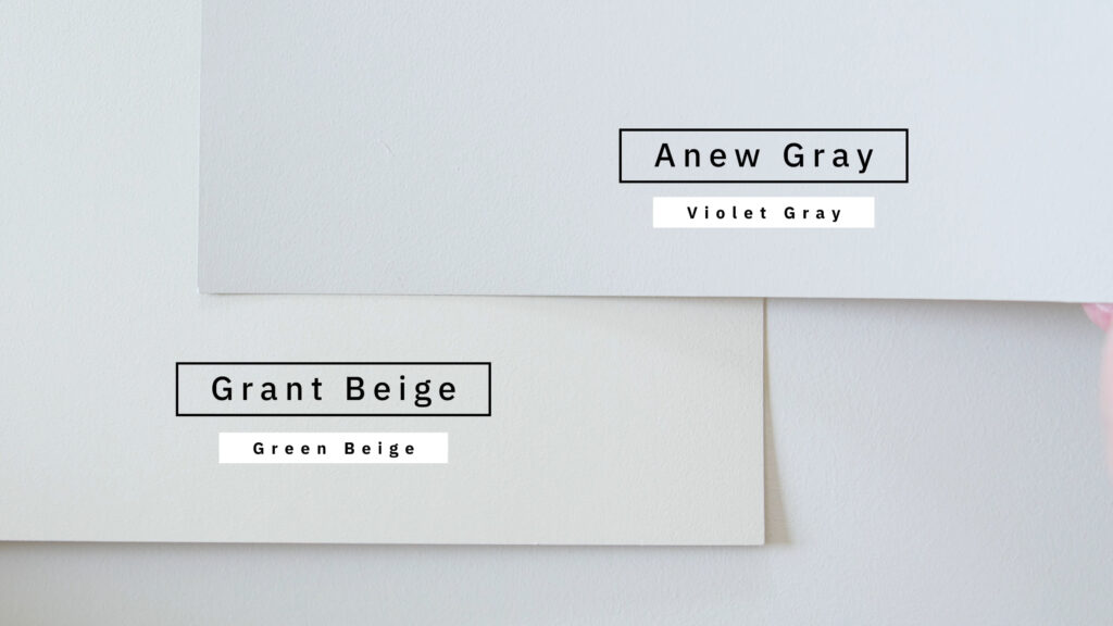
Undertone Number One: Green Beiges
I’ve selected two different green beiges. The first one is Manchester Tan. Watch what happens when I compare it with Anew Gray, which is considered a violet gray. When you compare Anew Gray with Manchester Tan, you can instantly see the green beiges in Manchester Tan.
The second one I’ve selected is called Benjamin Moore Grant Beige. When you compare Grant Beige with Anew Gray, again, you can instantly see the green beiges in Grant Beige.

Pro Grade Paint Roller Kit, Brush & Roller for Professionals & Homeowners
Perfect for smooth finishes on your interior walls. Ideal for home improvement enthusiasts!
Buy Now on Amazon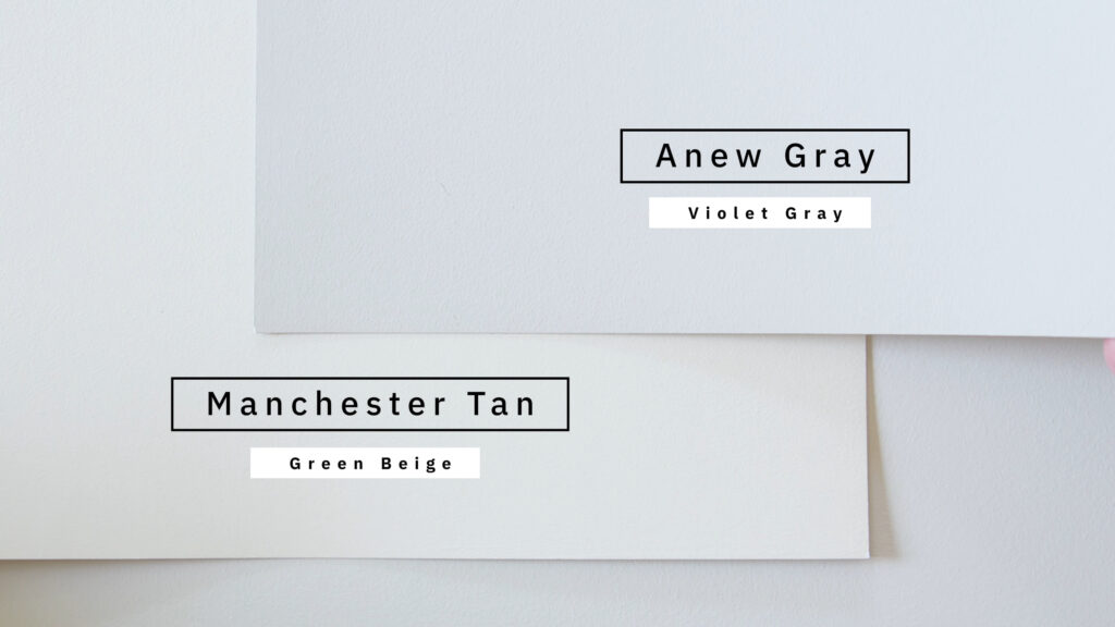
Now that you know about green beiges, you’ve got to be careful about how you compare these with your fixed elements and the type of lighting you have in your home. When you pair it right, it really shouldn’t look like a dominant green. It should be very subtle. But if you don’t pair it right, then chances are the interior walls of your home are going to look really green.

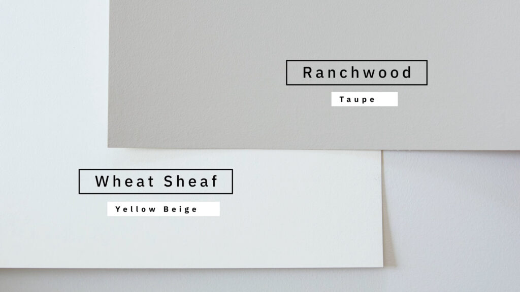
Undertone Number Two: Yellow Beiges
I’ve selected two different yellow beiges to help give you an idea of what a yellow beige looks like. The first one is called Benjamin Moore Wheat Sheaf, and I’m going to compare it to a taupe called Ranchwood. When you compare Ranchwood with Wheat Sheaf, you instantly see the yellow undertones in Wheat Sheaf.
The second one may surprise many of you—it’s called Navajo White. Often online, you’re going to see a lot of people say Navajo White is a cream, but actually, it’s really a yellow beige. When you compare it with Ranchwood, again, you’re going to see that yellow beige in Navajo White.
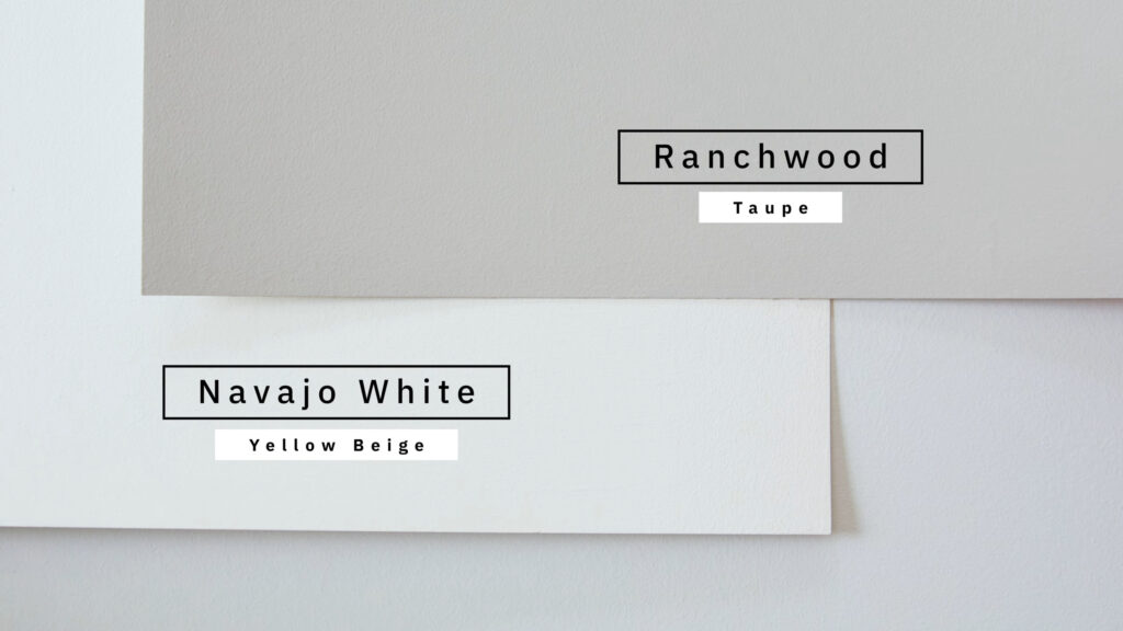
You’ve got to be really careful when you’re working with yellow beiges. If you don’t get a lot of natural lighting, the interior walls can look really yellow. But when you pair it correctly with your fixed elements and you’re mindful of the type of lighting you have in your home, it will pair fantastically and won’t look so much like a yellow beige.

Rust-Oleum 367605 Home Interior Floor Coating Kit, Semi-Gloss Black
Ideal for updating outdated flooring at a fraction of the cost of replacement and adheres without stripping, sanding or priming.
Buy Now on AmazonUndertone Number Three: Orange Beiges
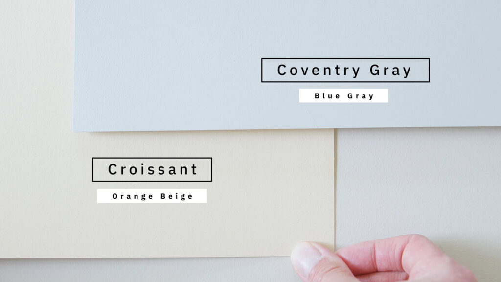
The first orange beige I selected is called Papaya by Benjamin Moore. When I compare it with Coventry Gray, which is considered a blue-gray, you will instantly see the orange beige undertones in Papaya.
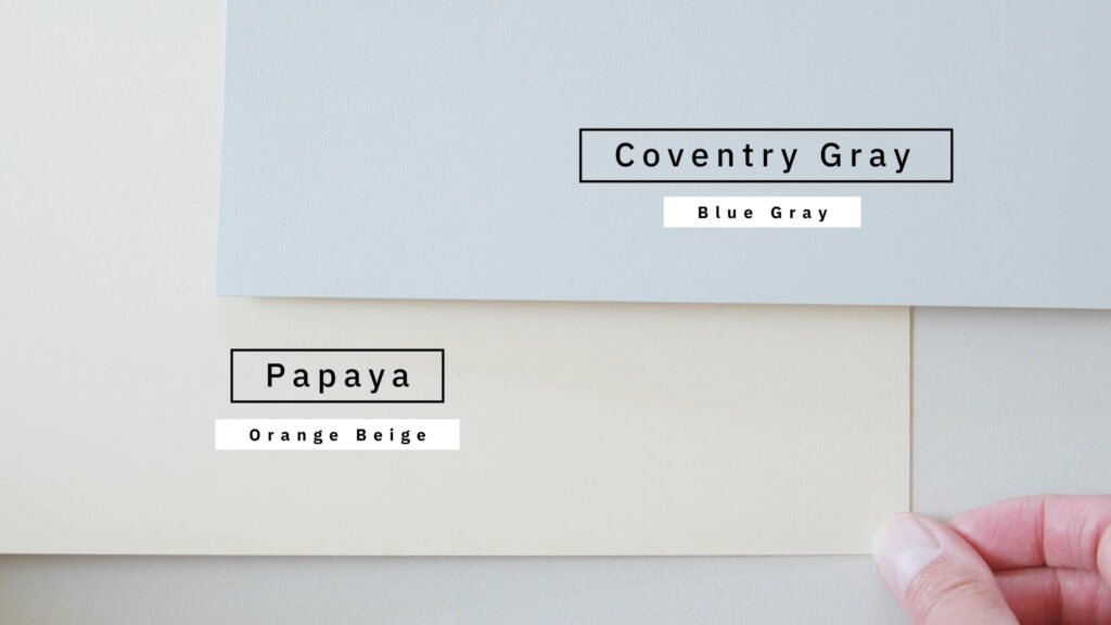
The other one I’ve selected is called Croissant by Sherwin-Williams. When you compare Croissant with Coventry Gray, again, you instantly see the orange beige undertones of Croissant.
You need to be really careful when you’re working with orange beiges, particularly the undertones. If you have taupes or pinkish taupes in your home, then painting your interior walls in orange beige is going to make that pink pop out and make the interior walls look more orange than they really are.
Undertone Number Four: Pink Beiges
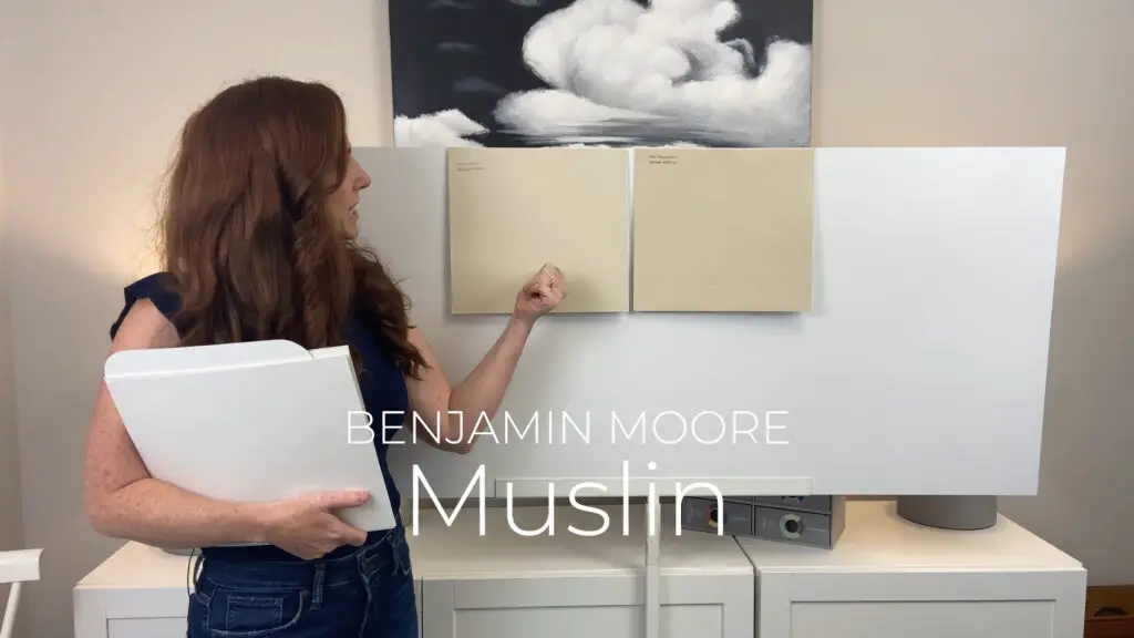
The first one I’m going to show you is a paint color called Benjamin Moore Muslin. A lot of people claim that it’s a taupe, but it’s not—it’s a pink beige. I can’t tell you how many clients have contacted me after they painted their home or space with Muslin, saying, “Jacob, my walls or my space looks pink.”
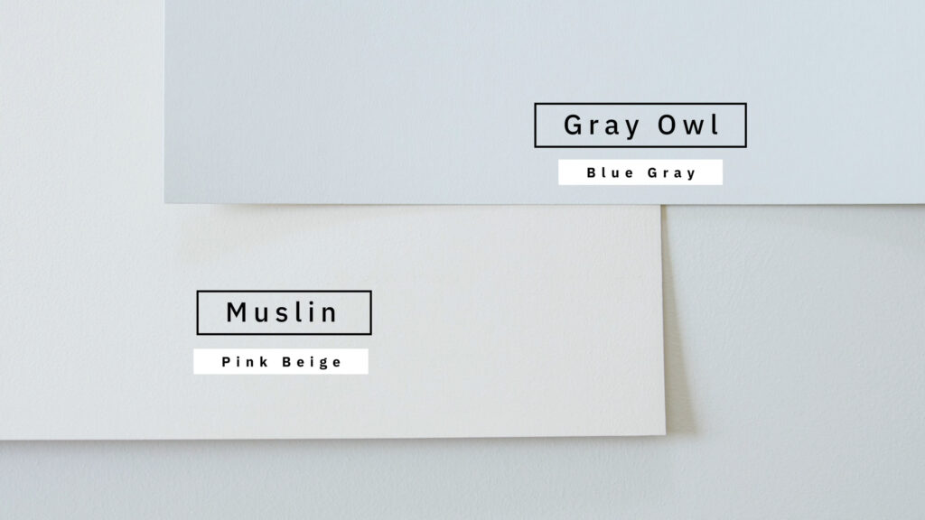
When I compare this with Gray Owl by Benjamin Moore, which is considered a blue-gray, you instantly see the pink beige undertone in Muslin.
The next one I’m going to compare is called Maritime White. This is a really good example of why you shouldn’t select a paint color by its name. Maritime White is not a white; it’s a pink beige. When you compare Maritime White with Gray Owl, you instantly see the pink beige in Maritime White.
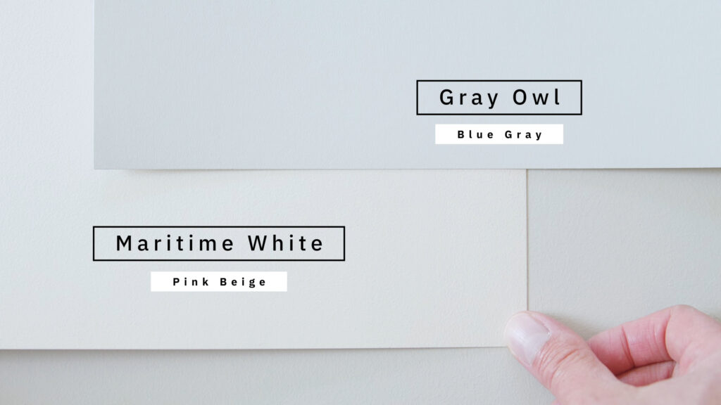
When you pair a pink beige correctly, it should not look like a pink wall. That’s super important. That’s why I say you really have to take your time. Be mindful of the type of lighting in your home—not just the fixed elements. Also, don’t forget about your interior decor.
Undertone Number Five: Gold Beiges
A good example is Safari from Sherwin-Williams. When I compare Safari with Charlotte Slate by Benjamin Moore, which is considered a blue-green, you instantly see how gold Safari looks.
The next one I’m going to pair is called Benjamin Moore Shelburne Buff. When I compare this with Charlotte Slate, again, you see the gold beige in Shelburne Buff.
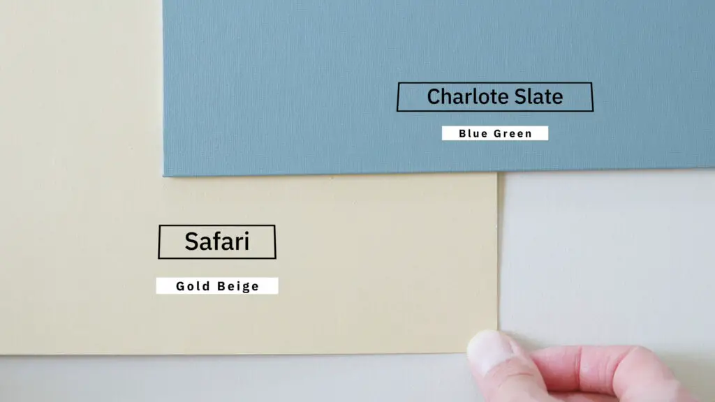
When I’m using these types of paint colors, I’m usually trying to create a warm, cozy ambiance. But depending on your fixed elements, you’ve got to be really careful. If you compare gold beiges with something very clean or light, your walls may end up looking muddy or dirty—and I don’t want that to happen to you. So please be cautious when comparing gold beiges with what you have in your home.
For those of you who find this blog helpful, let me know by giving it a like.
Now that you know there are five different undertones in the world of beiges, the question is: which beige undertone is going to pair best with what you have in your home? You can keep researching or keep buying different paint samples, or you can get it right the first time by checking out the link in the description section.
It will take you to my website, where I show how I can help you—regardless of where you live. I’m an online color consultant. I help people with both interior and exterior paint colors. I highly encourage you to read the reviews and see what clients have to say.
Lighting and Fixed Elements: A Key Role
Next, I’m going to talk about why lighting and fixed elements will play a key role in how all these different beige undertone paint colors will look in your home. Lighting and fixed elements are intertwined. There are just so many factors you need to be aware of.
If this is your first time seeing me in a blog, I highly recommend going to my website and using the search bar. Most of these paint colors I’ve already discussed. You’ll find out what happens when you compare them with different types of fixed elements. You’ll also learn how each of these paint colors reacts depending on whether you have a north-facing or south-facing room, etc.
For example, if you want to paint your home with Manchester Tan, which is a green beige, you need to ask yourself: What type of kitchen cabinets do you have? Are they off-white or more on the warm side? What’s your kitchen backsplash? What are your countertops and flooring like?
And also, be mindful of lighting. If you don’t receive a lot of natural light, don’t be surprised if Manchester Tan ends up looking greener than it really is. This is why lighting plays such a huge role—not just fixed elements.
There’s a lot to consider when it comes to all these different beige undertones. It can get really overwhelming, and I get it. The best advice I can give you is to get a paint sample, compare it with your fixed elements, move it around, see what it looks like at different times of day, and be mindful of your artificial lighting too.
What’s Trending Today?
For those of you who remember, at the beginning of this blog I mentioned I’d tell you what beige undertones are trending today. They have a grayish tint in them, which means it’s a mix of beige and a little bit of gray.
Now, you might look at these and say, “Okay, I see how they’re warm neutrals, but I don’t see orange necessarily.” And it’s tricky with neutrals because you’re seeing the mass tone—you’re seeing beige, not necessarily orange. Sometimes, you need comparison to see those undertones.
Spotting Orange Undertones
If we look at Sherwin Williams Wool Skein, which is actually a tan, that might help you see how these warm neutrals could have a nice orange backdrop in them.
Softer Tan and Its Versatility
Next up, Sherwin Williams Softer Tan—an interesting one because it can live in both worlds. You can see there’s more yellow in it compared to Kilim Beige and Muslin, but it’s a bit of a chameleon. It can move around a bit, and I love the versatility of it.
Accessible Beige: Popular and Muted
Accessible Beige is one of the more muted and most popular beige options. It’s got a heck of a lot of gray in there—it almost looks a bit taupey gray in comparison. It’s a bit of a weird one.
Sometimes, I’ve seen it pick up a minor green undertone, meaning it might nod toward gray. But other times, you can’t pull green out of it for the life of you. These colors that don’t commit 100% to one undertone can really move around and give you great versatility.
Ivory and Shaker Beige: Comparing Warmth
Ivory brings a little more yellow, saturation, and chroma compared to the orange-based ones. That contrast might help you see how orange-pink some of the others are.
Shaker Beige by Benjamin Moore has a little more depth and body than beige and certainly more than Muslin. Here, we’re just looking at shifts in undertones and depths—we want to get our eyeballs on these colors and see them in action.
Chinchilla and Natural Linen
Sherwin Williams Chinchilla is a beautiful warm beige. It actually has more pink in it compared to the orange tones in the previous ones, but it’s still an orange-pink base.
Sherwin Williams Natural Linen is amazing. I love this color, and I think it’s going to be a big trend as things get warmer. It’s way more muted, soft, and simple—less committed to any dominant undertone. You might see the orange more clearly in comparison.
Off-White Confusion: Moderate White
We’ve got Sherwin Williams Moderate White, which is actually an off-white. Off-whites often get confused for creams because they’re in that lighter range. Moderate White still has a very reasonable orange base in it. It’s one of the nicest off-white beiges.
Final Recommendation: Maritime White
I also love Benjamin Moore Maritime White—super pretty.
There you go! A nice range of beige colors for you to check out.
My Final top 5s
Versatility at Its Best
Beige pairs well with almost any color palette, making it ideal for a cohesive home design. Whether your style is traditional, modern, or eclectic, beige has a way of fitting in beautifully.
The Warmth Factor
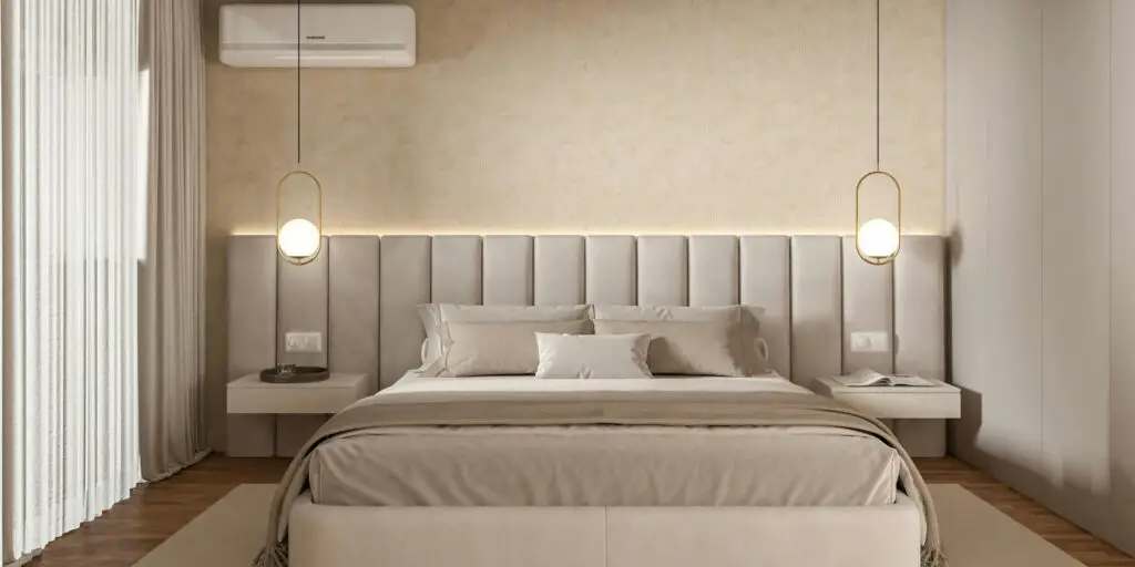
Unlike gray, beige adds warmth to your space. It brings that cozy, inviting feel that makes a house feel like a home. If you love warm and welcoming spaces, beige could be your go-to.

Comfort in Familiarity
There’s a nostalgic quality to beige. It’s a shade many people grew up with, and while that could be seen as dated, it also gives off a comforting, grounded vibe that resonates with many homeowners.
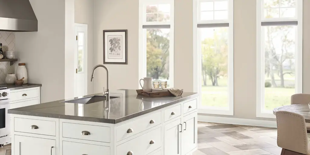
How to Choose the Right Beige
Choosing the perfect beige involves considering your home’s style and the amount of natural light you get.
- Bright Rooms: Go for a deeper, richer beige (around 65–70 LRV) to keep the color from washing out.
- Darker Rooms: You can either brighten things up with a light beige or lean into richness with a midtone shade.
My Top 5 Beige Paint Colors
Let’s explore my favorite beige tones from different brands:
1. Baja by Behr
- LRV: 55
A classic beige with golden undertones—this is Behr’s best true beige. It’s rich, warm, and timeless.
2. Shaker Beige by Benjamin Moore
- LRV: 52
A midtone beige with a gold-yellow undertone. It has great depth and works beautifully in traditional settings.
3. Bleeker Beige by Benjamin Moore
- Also around 52 LRV, this shade is slightly toned down with a hint of gray. It keeps its beige identity while offering a more contemporary look.
4. Kilim Beige by Sherwin-Williams
- LRV: 57
This lighter shade leans more into brown-bronze warmth than gold. It’s airy, elegant, and still carries that beige richness.
5. Accessible Beige by Sherwin-Williams
This is a muted, soft beige with a touch of gray. It’s the most versatile option here and the lightest of the five. If you’re unsure where to start, this beige is a safe and beautiful bet.