Purple and violet are often overlooked in home design, but they have the power to create spaces that are elegant, calming, and full of personality. Whether you’re aiming for a bold statement or a subtle hint of color, these shades can add sophistication and depth to any room.
I often get questions about how to incorporate purple and violet into home interiors, so I’ve put together this guide with some of my favorite shades from Benjamin Moore, Farrow & Ball, and Sherwin Williams—plus tips on how to use them effectively in different spaces.
Would you use these colors in your home? If you’re considering it, keep reading to find the perfect shade and style for your space!
Why Choose Purple or Violet for Your Home?
Purple and violet are unique in interior design because they offer a balance of warmth and coolness. These colors are associated with luxury, creativity, and tranquility—qualities that make them ideal for a variety of spaces, from cozy bedrooms to sophisticated living rooms.
Here’s why you should consider incorporating them into your home:

Pro Grade Paint Roller Kit, Brush & Roller for Professionals & Homeowners
Perfect for smooth finishes on your interior walls. Ideal for home improvement enthusiasts!
Buy Now on Amazon- Creates a calming effect – Soft purples, like lavender and lilac, bring a serene atmosphere to bedrooms and relaxation spaces.
- Adds drama and depth – Darker shades like aubergine or deep plum create a rich and moody ambiance.
- Works well with neutrals – Purple pairs beautifully with grays, whites, and even warm beige tones.
- Feels luxurious and timeless – Whether modern or classic, purple has been a symbol of elegance for centuries.
Best Purple and Violet Paint Shades from Top Brands
If you’re looking for the best shades of purple and violet, here are some standout options from Benjamin Moore, Farrow & Ball, and Sherwin Williams:
Benjamin Moore’s Best Purple Shades
- Shadow 2117-30 – A deep, dramatic purple with a velvety undertone, perfect for moody interiors.
- Gentle Violet 2071-20 – A soft, muted violet with a touch of gray, ideal for bedrooms and nurseries.
- Enchanted 2070-50 – A vibrant, playful purple that works well as an accent color.
- French Lilac 1403 – A light and airy lilac with a subtle warmth, great for creating a cozy yet sophisticated space.
- Grape Juice 2074-10 – A rich and bold grape-toned purple for those who love deep, saturated colors.
Farrow & Ball’s Best Purple Shades
- Pelt No. 254 – A strong and dramatic aubergine shade that adds sophistication.
- Calluna No. 270 – A soft and airy lavender that looks stunning in natural light.
- Brassica No. 271 – A muted, slightly grayish purple that works well in both modern and classic interiors.
- Cinder Rose No. 246 – A warm pinkish-purple that pairs beautifully with creamy whites.
- Paean Black No. 294 – A deep, inky purple with red undertones, perfect for bold statement walls.
Sherwin Williams’ Best Purple Shades
- Veiled Violet SW 6268 – A soft, muted violet with a neutral undertone, great for calming spaces.
- Indulgent SW 6969 – A rich and luxurious dark purple, ideal for dramatic interiors.
- Forget-Me-Not SW 6824 – A delicate pastel violet that works well in airy and feminine spaces.
- Grape Harvest SW 6285 – A warm purple with earthy undertones, suitable for cozy settings.
- Dewberry SW 6552 – A jewel-toned, royal purple that makes a bold and artistic statement.
How to Use Purple and Violet in Your Home
Now that you have a list of gorgeous purples to choose from, here’s how to use them effectively in different spaces:
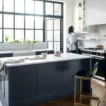
1. Living Room: Bold and Inviting
Best Shades: Shadow 2117-30 (Benjamin Moore), Pelt (Farrow & Ball), Indulgent (Sherwin Williams)
- Accent walls: A deep purple or aubergine wall creates a cozy, intimate feel.
- Pair with metallics: Gold, brass, and silver accents enhance the richness of purple.
- Layer with neutrals: Combine deep purples with gray, beige, or white furniture for balance.
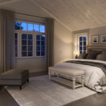
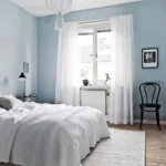
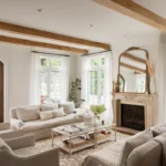
2. Bedroom: Soft and Serene
Best Shades: Calluna (Farrow & Ball), Gentle Violet (Benjamin Moore), Veiled Violet (Sherwin Williams)

Rust-Oleum 367605 Home Interior Floor Coating Kit, Semi-Gloss Black
Ideal for updating outdated flooring at a fraction of the cost of replacement and adheres without stripping, sanding or priming.
Buy Now on Amazon- Create a tranquil retreat: Use soft lavender or muted violets for a restful environment.
- Mix with plush textures: Velvet headboards, linen bedding, and cozy throws enhance the luxurious feel.
- Pair with soft whites: Light purples with crisp white trims create a dreamy, airy aesthetic.
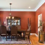
3. Kitchen & Dining: Elegant and Unique
Best Shades: Brassica (Farrow & Ball), Grape Harvest (Sherwin Williams), Enchanted (Benjamin Moore)
- Cabinetry: Deep purple kitchen cabinets create a regal yet modern look.
- Backsplash statement: A purple-tinted tile backsplash adds personality to the kitchen.
- Pair with natural wood: Light wood finishes tone down the boldness and bring warmth.
4. Bathroom: Spa-Like Retreat
Best Shades: French Lilac (Benjamin Moore), Forget-Me-Not (Sherwin Williams), Cinder Rose (Farrow & Ball)
- Soft lilac walls: Give your bathroom a light and refreshing spa-like feel.
- Pair with marble: White or gray marble enhances the elegance of purple hues.
- Add greenery: Plants with purple undertones, like lavender or orchids, tie the look together.
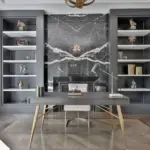
5. Office or Study: Inspiring and Focused
Best Shades: Paean Black (Farrow & Ball), Dewberry (Sherwin Williams), Shadow (Benjamin Moore)
- Boosts creativity: Purple is known to stimulate creativity and focus.
- Use as an accent: A deep purple feature wall or built-in bookshelf adds character.
- Pair with wood and brass: Dark wood desks and brass fixtures complement purple beautifully.
Complementary Color Palettes for Purple
Not sure what colors to pair with purple? Here are some great combinations:
- Purple + Gray: Creates a sophisticated and balanced look.
- Purple + White: Keeps the space feeling fresh and modern.
- Purple + Gold: Adds a touch of luxury and glamour.
- Purple + Green: Inspired by nature, this combo feels fresh and earthy.
- Purple + Blush Pink: Soft and romantic, perfect for bedrooms.
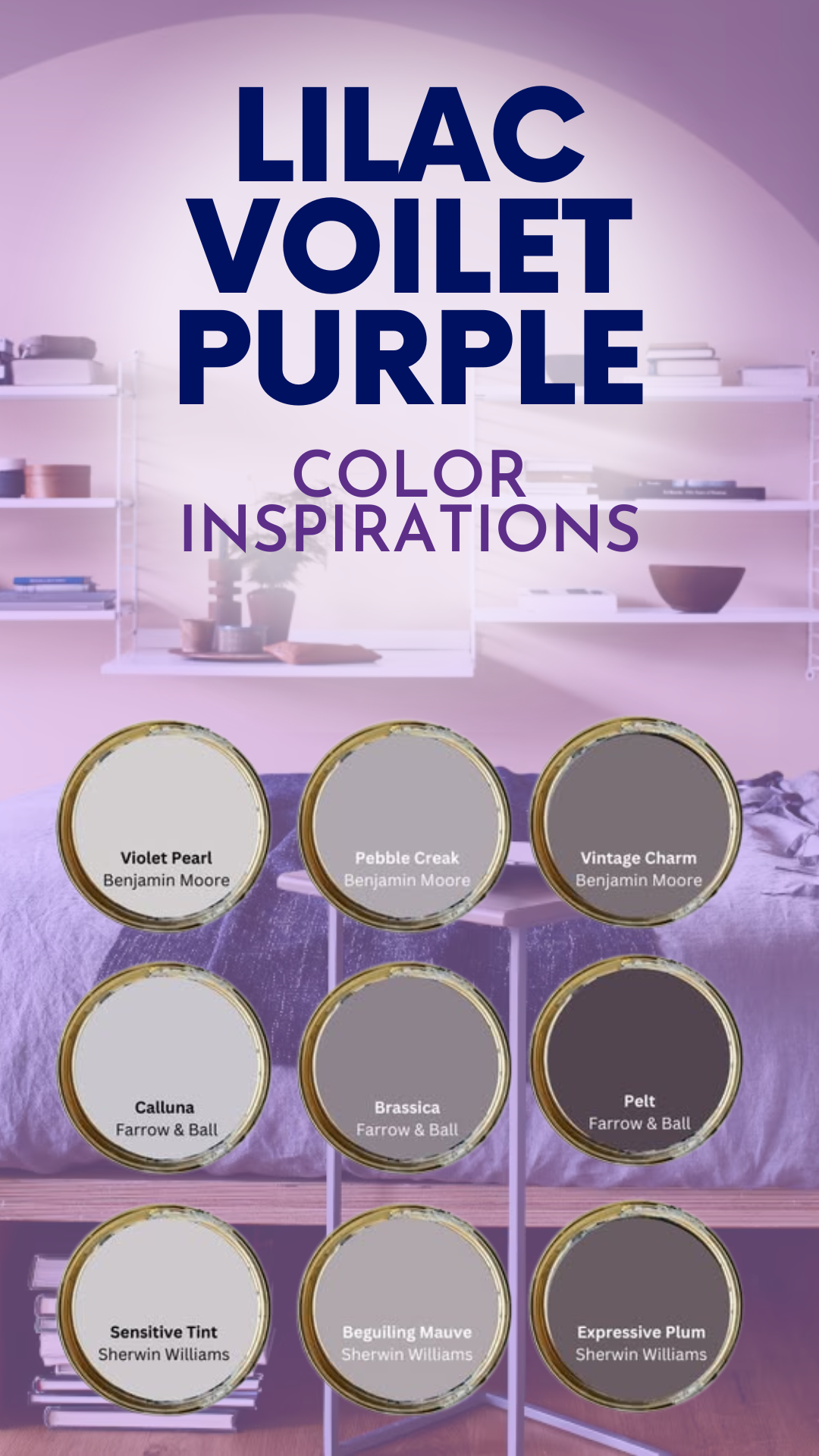
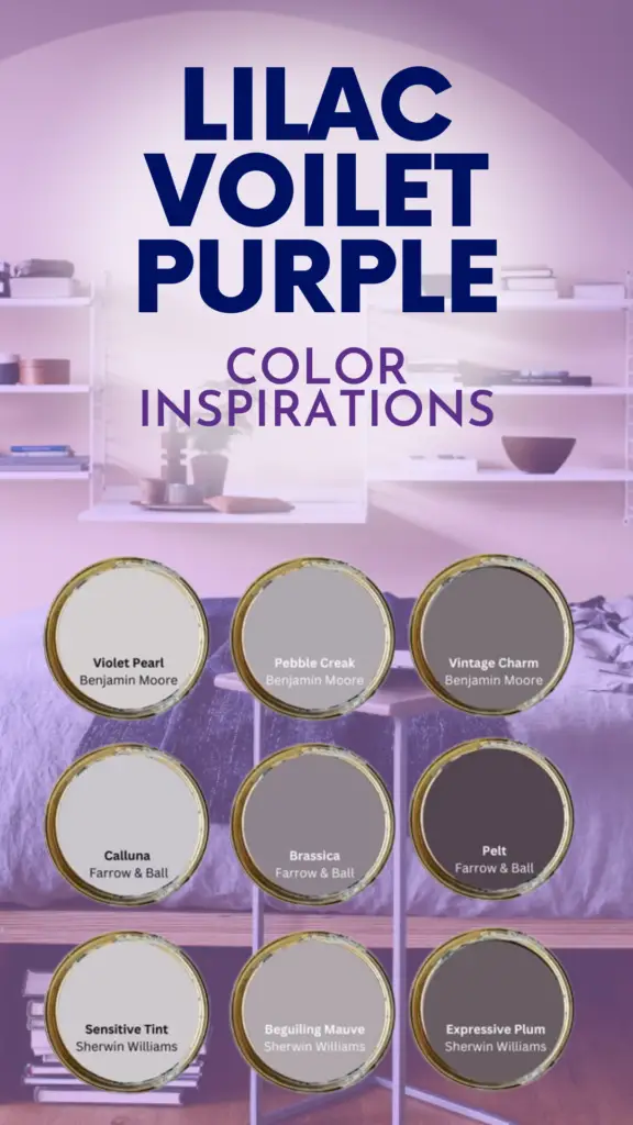
1. Violet Pearl – Sherwin Williams
Color Information
- Undertones: Cool violet with a hint of blue-gray
- Finish: Works well in both matte and satin finishes
- Vibe: Soft, airy, and modern
Best Uses
✅ Ideal for bedrooms, nurseries, and home offices
✅ Works as a calming backdrop in living rooms and bathrooms
✅ Pairs well with crisp white trims and silver or chrome accents
Pros & Cons
✔️ Creates a peaceful, spa-like ambiance
✔️ Looks fresh and modern with white and gray tones
❌ Can feel too cool in rooms with low natural light
Pro Tips
🔹 Use warm lighting to balance the cool undertones
🔹 Pair with soft gray or pastel pink for a sophisticated look
2. Pebble Creek – Benjamin Moore
Color Information
- Undertones: Soft violet with earthy taupe undertones
- Finish: Satin or eggshell for a subtle sheen
- Vibe: Neutral with a hint of color
Best Uses
✅ Great for living rooms, kitchens, and transitional spaces
✅ Works as a subtle accent color for cabinets or built-ins
✅ Pairs beautifully with natural wood finishes and warm whites
Pros & Cons
✔️ Neutral enough to work with various color palettes
✔️ Adds depth without overwhelming a space
❌ Can look washed out in very bright natural light
Pro Tips
🔹 Combine with beige and taupe tones for a warm, earthy feel
🔹 Add gold or brass accents for a touch of elegance
3. Vintage Charm – Benjamin Moore
Color Information
- Undertones: Muted lavender with grayish-beige hints
- Finish: Matte or eggshell for a sophisticated touch
- Vibe: Soft, romantic, and timeless
Best Uses
✅ Perfect for bedrooms, sitting areas, and dining rooms
✅ Works well in traditional and farmhouse-style interiors
✅ Complements light wood furniture and classic décor
Pros & Cons
✔️ Delivers a soft and vintage-inspired aesthetic
✔️ Pairs well with antique and classic furniture pieces
❌ May appear too muted in low-light rooms
Pro Tips
🔹 Layer with deep plum or navy blue for contrast
🔹 Works beautifully with textured fabrics like linen and velvet
4. Calluna – Farrow & Ball
Color Information
- Undertones: Soft, powdery lavender with a cool gray base
- Finish: Eggshell or modern emulsion for a subtle glow
- Vibe: Tranquil, elegant, and airy
Best Uses
✅ Ideal for bedrooms, bathrooms, and reading nooks
✅ Pairs well with crisp whites and soft grays for a serene look
✅ Works beautifully in both contemporary and vintage interiors
Pros & Cons
✔️ Creates a peaceful, dreamy atmosphere
✔️ Has a delicate, timeless appeal
❌ Can feel too cool in rooms with north-facing light
Pro Tips
🔹 Use warm wood tones to add coziness
🔹 Pair with floral patterns for a classic English countryside feel
5. Brassica – Farrow & Ball
Color Information
- Undertones: Deep purple with rich, warm gray tones
- Finish: Estate emulsion for a velvety finish
- Vibe: Sophisticated and moody
Best Uses
✅ Works well in dining rooms, libraries, and home offices
✅ Creates a luxurious statement in hallways and entryways
✅ Pairs beautifully with brass fixtures and dark wood tones
Pros & Cons
✔️ Adds warmth without being overly bold
✔️ Works well in both traditional and modern settings
❌ Can make small rooms feel enclosed if not balanced with lighter tones
Pro Tips
🔹 Combine with off-white trims for a classic look
🔹 Use indirect lighting to enhance its depth
6. Pelt – Farrow & Ball
Color Information
- Undertones: Rich aubergine with dark, moody undertones
- Finish: Glossy or estate emulsion for a dramatic effect
- Vibe: Bold and opulent
Best Uses
✅ Excellent for accent walls and statement ceilings
✅ Adds drama to dining rooms and powder rooms
✅ Works beautifully with metallic and jewel-tone accents
Pros & Cons
✔️ Creates a luxurious and high-end feel
✔️ Pairs well with bold furniture and statement lighting
❌ Can feel heavy if overused in small spaces
Pro Tips
🔹 Use in moderation for a sophisticated effect
🔹 Pair with deep green or navy for a regal look
7. Sensitive Tint – Sherwin Williams
Color Information
- Undertones: Soft purple with a hint of warm pink
- Finish: Satin or eggshell for a subtle sheen
- Vibe: Feminine, cozy, and inviting
Best Uses
✅ Ideal for nurseries, dressing rooms, and cozy bedrooms
✅ Works as a delicate pastel in modern and minimalist spaces
✅ Complements natural wood and soft white tones
Pros & Cons
✔️ Feels light and uplifting without being overpowering
✔️ Adds warmth to cooler spaces
❌ Can feel too pastel-like in rooms with bright white lighting
Pro Tips
🔹 Pair with soft cream or blush tones for a dreamy effect
🔹 Works beautifully with rattan and light wood furniture
8. Beguiling Mauve – Sherwin Williams
Color Information
- Undertones: Warm mauve with hints of taupe
- Finish: Matte or satin for a velvety look
- Vibe: Romantic and elegant
Best Uses
✅ Great for bedrooms, dining rooms, and lounge areas
✅ Works well in traditional and contemporary spaces
✅ Pairs with soft whites and light grays for a refined look
Pros & Cons
✔️ Adds warmth without being too intense
✔️ Looks stunning with antique and vintage furniture
❌ Can read as too pink in certain lighting
Pro Tips
🔹 Use with warm lighting to enhance its richness
🔹 Pair with deep navy or charcoal for contrast
9. Expressive Plum – Sherwin Williams
Color Information
- Undertones: Deep plum with slight red undertones
- Finish: Glossy or satin for a luxurious feel
- Vibe: Dramatic, bold, and artistic
Best Uses
✅ Best suited for feature walls, entryways, and moody bedrooms
✅ Works well in eclectic and modern interiors
✅ Complements dark wood furniture and jewel-toned décor
Pros & Cons
✔️ Creates a rich, immersive atmosphere
✔️ Adds personality to any space
❌ May feel overpowering if used excessively
Pro Tips
🔹 Use with gold or brass accents for a regal touch
🔹 Balance with soft neutrals to avoid feeling too dark
Final Thoughts
Whether you prefer deep, dramatic purples or soft and subtle violets, there’s a perfect shade for every space. Benjamin Moore, Farrow & Ball, and Sherwin Williams offer a range of stunning purple hues that can transform your home into a stylish and sophisticated retreat.
Would you use purple in your home? If so, which shade is your favorite? Let me know in the comments! 😊💜