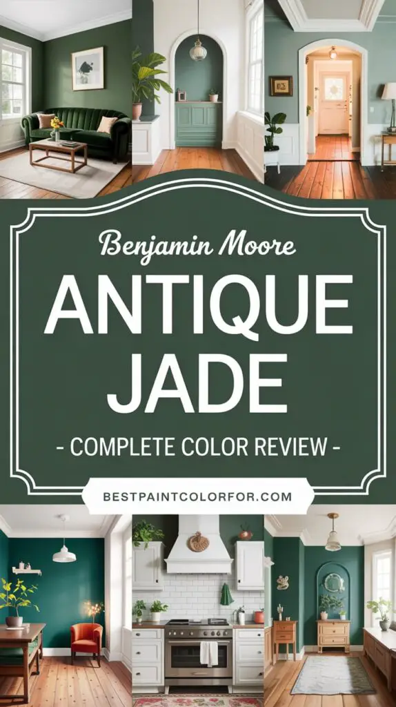
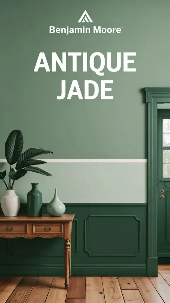
If you’re on the hunt for the perfect green paint color that blends timeless charm with a modern edge, allow me to introduce you to a shade that quietly commands attention – Benjamin Moore Antique Jade (465).
Whether you’re redecorating a cozy bedroom, updating your kitchen cabinets, or dreaming up a tranquil bathroom oasis, Antique Jade delivers a refreshing, balanced color that feels both grounded and uplifting. Let’s dive deep into everything you need to know about this beautiful shade and why it might be just what your home has been waiting for.
🌿 What Makes Antique Jade So Special?
There’s just something about soft greens. They mimic the calm of nature, the serenity of leaves rustling in the breeze, and the effortless charm of a garden after rain. Antique Jade taps into all of that – it’s not flashy or loud, but it has presence. It’s the type of green that makes a space feel alive without overwhelming it.
This shade is subtle yet impactful – ideal for anyone wanting a color that’s interesting but livable.
🎨 Paint Profile: Benjamin Moore Antique Jade (465)
- Color Family: Green
- Light Reflectance Value (LRV): 54
- Undertones: Soft gray with a hint of blue in cooler lighting
- Finish Options: Available in multiple sheens from matte to gloss

🟢 Fun fact: Antique Jade (465) is the same color as Maid of the Mist (CC-728). So don’t be confused if you see either name listed – it’s the same stunning shade.

Pro Grade Paint Roller Kit, Brush & Roller for Professionals & Homeowners
Perfect for smooth finishes on your interior walls. Ideal for home improvement enthusiasts!
Buy Now on Amazon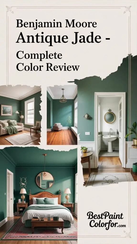
🧪 Let’s Break It Down: Color Science
🧬 RGB Values:
- Red: 188
- Green: 199
- Blue: 184
This balanced mix gives Antique Jade its gentle, muted look. It’s not too warm, not too cool – just the right touch of green.
🌐 Hex Code:
#BCC7B8
Perfect if you’re trying to match colors for digital or design projects.
💡 LRV 54 – What Does It Mean?
With a Light Reflectance Value of 54, Antique Jade sits in the “light to mid-tone” range. It reflects a moderate amount of light, making it versatile in both bright and dim rooms.
- In bright natural light (especially south-facing rooms), it looks lighter, airier, and slightly warmer.
- In low light or north-facing spaces, it shifts to a cooler, slightly bluish-green tone.
This chameleon quality makes it perfect for rooms where lighting changes throughout the day.

Rust-Oleum 367605 Home Interior Floor Coating Kit, Semi-Gloss Black
Ideal for updating outdated flooring at a fraction of the cost of replacement and adheres without stripping, sanding or priming.
Buy Now on Amazon
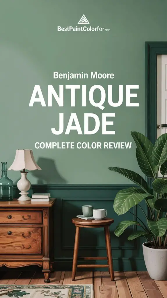
🏠 Where to Use Antique Jade in Your Home
This color is incredibly flexible. Think of it as a neutral with personality.
💚 Best Room Applications:
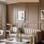
- Living Rooms: Adds a soft, natural backdrop without overpowering the space.
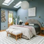
- Bedrooms: Calming and serene – perfect for rest and relaxation.
- Kitchens: Looks stunning on cabinets or walls, paired with brass or matte black hardware.
- Bathrooms: Creates a spa-like feel when paired with white tiles or natural stone.
- Entryways & Hallways: Welcoming and subtly chic.
- Exterior Accents: A beautiful choice for shutters, front doors, or porch ceilings.
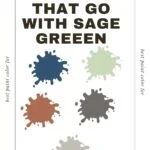
🛋️ Styling Tips: What Goes With Antique Jade?
Antique Jade is like the best supporting actor – it makes everything around it better. You can pair it with a wide range of coordinating colors depending on the vibe you’re going for.
🪵 Neutrals and Beiges:
- Greenbrier Beige
- Danville Tan
- Oak Ridge
- Baffin Island
These tones enhance the softness of Antique Jade while keeping the overall look warm and grounded.
🔵 Deep Blues:
- Hudson Bay
- Van Deusen Blue
- Newburyport Blue
- Evening Dove
This palette combination is sophisticated and bold, ideal for those who want a more dramatic contrast.
⚪ Crisp, Soft Whites:
- Benjamin Moore Simply White
- White Dove
- Cloud White
- Cotton Balls
These whites balance Antique Jade perfectly and are excellent choices for trim or ceilings.
🖼️ Trim Ideas:
For a classic look, go with warm whites:
- Benjamin Moore White Dove – creamy and soft
- Sherwin Williams Alabaster – cozy and bright
- Behr Cameo White – subtle and clean
🧾 FAQs About Antique Jade
Q: What are the undertones of Antique Jade?
A: Gray undertones make Antique Jade feel calm and elegant. In sunlight, it leans greener. In shadows, it shifts toward a cooler green-blue.
Q: How does it compare to Benjamin Moore Prescott Green?
A: Prescott Green is a touch lighter and slightly more vibrant. Antique Jade is a bit more muted and neutral, perfect if you want something that blends easily.
Q: What about Sherwin Williams Holly Glen?
A: Holly Glen has a slightly higher LRV (57) and is more saturated. Antique Jade leans more toward the subtle, soft side.
Q: Is there a Behr equivalent?
A: Try Behr Recycled Glass or Summer Green. They’re not identical, but close enough to give you a similar vibe.
Q: Is Antique Jade a good cabinet color?
Absolutely. It’s soft yet impactful. Pair it with gold, brass, or matte black hardware for a modern twist. Use it for lower cabinets or an island if you want a pop of color that’s not too loud.
🌈 Want a Foolproof Palette?
We’ve got you covered. Antique Jade is part of our curated color palette that includes:
- The perfect soft white trim
- 6 gorgeous coordinating accents (including bold, rich colors and warm neutrals)
- Options for walls, cabinetry, doors, and more
🎨 Grab your exclusive Benjamin Moore Antique Jade Color Palette and take the guesswork out of decorating.
✨ Final Thoughts
Benjamin Moore Antique Jade is the green you didn’t know you needed. It’s refined but cozy, elegant but easygoing. It brings a natural, serene touch into your home while staying incredibly versatile – it’s like a breath of fresh air for your walls.
From soothing bedrooms to stylish kitchen cabinets, this is one shade that quietly transforms a room without overpowering it. Whether you’re a minimalist or love layered, collected interiors, Antique Jade finds a way to work with your style.
🔖 Don’t Forget:
✅ Always swatch before committing
✅ Check the color in both daylight and at night
✅ Pair it with coordinating tones for a pulled-together look