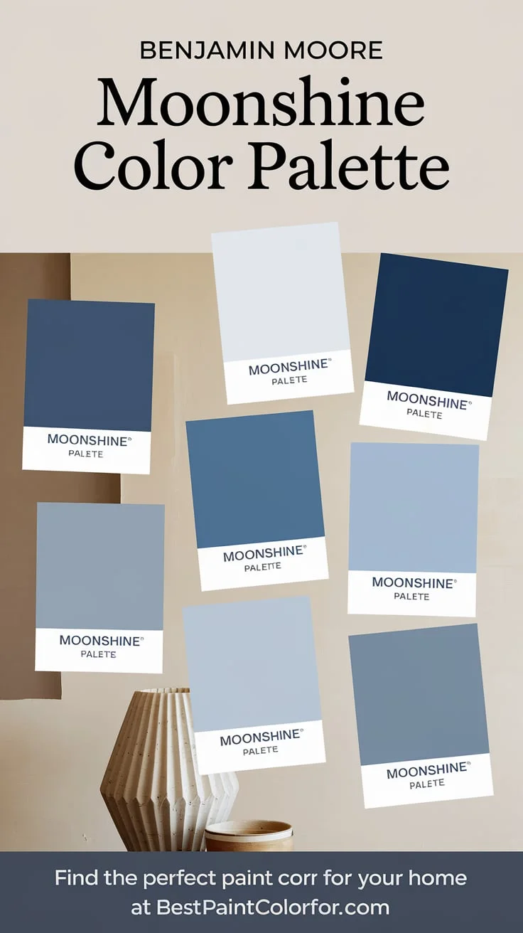
Introduction to Benjamin Moore Moonshine
A Versatile and Modern Neutral Gray
Benjamin Moore Moonshine is a paint color that embodies versatility and elegance. This neutral gray hue transcends traditional color boundaries, offering a fresh, modern appeal that seamlessly integrates into any interior design scheme. Its understated yet sophisticated tone makes it an ideal choice for those seeking a backdrop that is both timeless and contemporary.
Why Moonshine is a Designer Favorite
Designers adore Moonshine for its adaptability. It harmonizes effortlessly with a wide array of color palettes, providing a perfect canvas for both bold and subtle decor accents. Its nuanced composition of cool undertones allows it to enhance the aesthetic of any room, making it a preferred choice for both residential and commercial spaces.
Color Profile of Moonshine
HEX, RGB, and LRV (Light Reflectance Value) Breakdown
Benjamin Moore Moonshine exhibits a sophisticated blend of neutrality and subtle depth.
– **HEX**: #D5D8D3
– **RGB**: 213, 216, 211
– **LRV**: 68.28
These values underscore its light-reflecting capabilities and gentle presence, making it an excellent choice for creating luminous, expansive spaces.

Pro Grade Paint Roller Kit, Brush & Roller for Professionals & Homeowners
Perfect for smooth finishes on your interior walls. Ideal for home improvement enthusiasts!
Buy Now on AmazonCool Undertones: A Soft, Airy Gray with Subtle Hints of Green/Blue
Moonshine’s ethereal gray is infused with just a whisper of green and blue undertones. This soft, airy quality grants it a tranquil and cooling effect, perfect for setting a serene ambiance. Its chameleon-like nature allows it to transition beautifully under different lighting conditions, making it a dynamic choice for any room.
Best Rooms for Benjamin Moore Moonshine
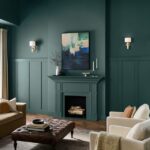
Living Rooms: A Calm, Light-Filled Backdrop
In living rooms, Moonshine serves as a calm and inviting canvas. It reflects natural light beautifully, creating a bright and airy atmosphere. Paired with neutral furnishings and pops of color, it transforms living spaces into serene retreats perfect for relaxation and socializing.
Bedrooms: Serene and Relaxing Atmosphere
Moonshine’s soothing qualities make it an ideal choice for bedrooms. Its subtle cool undertones introduce a calming effect conducive to rest and relaxation. When complemented with soft textiles and minimalist decor, it fosters a tranquil haven designed for restorative sleep.
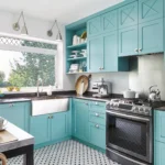
Kitchens: A Clean, Crisp Look Paired with White Cabinets
For kitchens, Moonshine offers a clean, crisp aesthetic. It harmonizes beautifully with white cabinetry, creating a fresh and modern look. This combination underscores an organized and hygienic space, perfect for meal preparation and family gatherings.

Rust-Oleum 367605 Home Interior Floor Coating Kit, Semi-Gloss Black
Ideal for updating outdated flooring at a fraction of the cost of replacement and adheres without stripping, sanding or priming.
Buy Now on AmazonHallways and Entryways: Brightening Narrow Spaces
In hallways and entryways, Moonshine’s light-reflecting properties help to brighten narrow and often dim spaces. Its neutral tone adds a touch of elegance while making these transitional areas feel more expansive and welcoming.
Complementary Colors for Moonshine
Cool Color Pairings
Benjamin Moore White Dove (OC-17)
White Dove is a warm, creamy white that balances Moonshine’s coolness beautifully. It is the perfect choice for trim, doors, and ceilings, offering a subtle contrast that enhances the overall brightness and sophistication of the space.
Benjamin Moore Hale Navy (HC-154)
Hale Navy introduces a deep, rich navy for a sophisticated contrast against Moonshine. This pairing works exceptionally well for accent walls, furniture, or cabinetry, adding depth and a touch of elegance to the decor.
Benjamin Moore Coventry Gray (HC-169)
Coventry Gray offers a slightly darker, cool gray that complements Moonshine perfectly. Ideal for monochromatic gray schemes or adjacent rooms, it creates a cohesive and harmonious look throughout the home.
Benjamin Moore Wrought Iron (2124-10)
Wrought Iron, with its soft charcoal black, adds a dramatic edge to Moonshine. It is particularly suitable for doors, trim, and accent pieces, ensuring a striking yet balanced design element.
Warm Color Pairings
Benjamin Moore Edgecomb Gray (HC-173)
Edgecomb Gray is a warm greige that softens Moonshine’s coolness. Perfect for connecting spaces or adjacent rooms, it introduces a subtle warmth while maintaining the understated elegance of the overall color palette.
Benjamin Moore Revere Pewter (HC-172)
Revere Pewter, a classic warm gray, adds depth to Moonshine’s cool tone. It is ideal for dining rooms and living spaces, where its warmth creates a cozy yet sophisticated ambiance.
Benjamin Moore Simply White (OC-117)
Simply White is a bright, clean white that enhances the freshness of Moonshine. Ideal for trim, molding, and cabinetry, it creates a crisp, clean contrast that brightens and refreshes any given space.
Earthy Accents
Benjamin Moore Silver Marlin (2139-50)
Silver Marlin is a muted green with gray undertones that complements Moonshine’s coolness. Particularly fitting for bedrooms and bathrooms, it adds an earthy, calming touch to these intimate spaces.
Benjamin Moore Pashmina (AF-100)
Pashmina, a taupe greige with warm undertones, provides a cozy contrast to Moonshine. Ideal for accent walls or living spaces, it enriches the color scheme with its inviting warmth.
Benjamin Moore Wythe Blue (HC-143)
Wythe Blue infuses a soft blue-green for a fresh, coastal vibe when paired with Moonshine. Perfect for bathrooms, accent walls, or cabinets, it captures a laid-back yet stylish ambiance.
Benjamin Moore Horizon (OC-53)
Horizon offers a pale blue-gray that adds a breezy, open feel to spaces complemented by Moonshine. Ideal for hallways, bedrooms, or bathrooms, it creates an expansive and tranquil atmosphere.
Design Styles for Moonshine
Scandinavian Minimalism: Moonshine with Natural Wood and Soft Whites
In Scandinavian minimalist design, Moonshine shines when combined with natural wood elements and soft whites. This pairing brings forth an aesthetic that is both clean and warmly inviting, reflecting the principles of simplicity and functionality central to Scandinavian design.
Modern Farmhouse: Pairing Moonshine with Reclaimed Wood and Black Accents
Moonshine’s cool, airy gray works beautifully in modern farmhouse styles when paired with reclaimed wood and black accents. This combination creates a harmonious blend of rustic charm and modern sophistication, crafting spaces that are both cozy and contemporary.
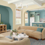
Coastal Chic: Moonshine with Light Blues, Seafoam Greens, and Crisp Whites
For a coastal chic look, Moonshine pairs delightfully with light blues, seafoam greens, and crisp whites. This blend evokes the serenity of the seaside, creating a refreshing, breezy atmosphere perfect for coastal-inspired interiors.
Transitional Style: Using Moonshine as a Neutral Base with Warm, Textural Elements
In transitional style, Moonshine serves as a neutral base that can be enhanced with warm, textural elements like plush fabrics and natural materials. This juxtaposition of modern and traditional elements results in a balanced, harmonious space that feels both timeless and current.
How Moonshine Performs in Different Lighting
Natural Light: A Cool, Soft Gray with Subtle Blue or Green Tones
Under natural light, Moonshine reveals its true character: a cool, soft gray with subtle hints of blue or green. This quality ensures a refreshing and airy feel that is both invigorating and tranquil, ideal for rooms with ample natural light.
Artificial Light: Moonshine Takes on Warmer, Slightly Beige Undertones
In artificial lighting, Moonshine shifts to exhibit warmer, slightly beige undertones. This adaptability makes it a versatile choice for spaces that transition between natural and artificial light throughout the day, maintaining a consistent inviting ambiance.
Using Moonshine as a Backdrop for Colorful Décor
Bright Jewel Tones like Emerald Green, Sapphire Blue, and Ruby Red for a Bold Look
Moonshine’s neutral base allows bright jewel tones to truly shine. Paired with emerald greens, sapphire blues, and ruby reds, it creates a bold and dynamic look. This combination is perfect for those seeking to inject personality and vibrancy into their living spaces.
Subtle Pastels like Blush Pink, Mint, and Lavender for a Soft, Feminine Aesthetic
For a softer, more feminine aesthetic, Moonshine pairs elegantly with pastel hues such as blush pink, mint, and lavender. This delicate palette fosters a serene and inviting atmosphere, ideal for creating a gentle and refined space.
Monochromatic Palette with Moonshine
Creating a Seamless, Layered Look with Lighter and Darker Grays
A monochromatic palette centered around Moonshine achieves a seamless, layered look by incorporating lighter and darker shades of gray. This approach adds depth and interest while maintaining a harmonious and cohesive aesthetic.
How to Add Depth with Textures in Fabrics, Rugs, and Furniture
To prevent a monochromatic scheme from feeling flat, textures play a crucial role. Introducing varied textures in fabrics, rugs, and furniture adds depth and dimension to the space. Plush velvet cushions, woven rugs, and metallic accents can transform a monochrome room into a tactile and visually engaging environment.
Conclusion: Versatility of Benjamin Moore Moonshine
A Perfect Neutral for Almost Any Space
Benjamin Moore Moonshine is an exemplary neutral that adapts beautifully to diverse environments. Its cool, versatile nature makes it suitable for nearly any space, offering a perfect balance between elegance and modernity.
Ideal for Those Seeking a Calm, Subtle, and Elegant Gray
For those in pursuit of a calm, subtle, and sophisticated gray, Moonshine stands unrivaled. Its ability to complement a wide range of colors and design styles makes it an indispensable choice for homeowners and designers alike, ensuring an effortlessly chic and inviting ambiance.