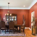
Dark blue is a sophisticated and timeless color that works beautifully in a hallway. However, without careful planning, it can make the space feel too dark or enclosed. To maintain a sense of balance, it’s essential to introduce lighter and neutral shades alongside dark blue. This guide will help you select complementary colors from top paint brands like Sherwin-Williams, Behr, and Benjamin Moore, ensuring your hallway feels inviting, stylish, and well-lit.
Best Dark Blue Paints and Their Complementary Neutrals
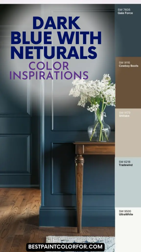
1. Sherwin-Williams Naval (SW 6244) & Alabaster (SW 7008)
Sherwin-Williams Naval is a deep, rich navy blue that adds depth and elegance to a hallway. This color exudes sophistication and works particularly well in transitional and contemporary homes. However, using it on all four walls might make the hallway feel too enclosed. To balance the depth of Naval, pair it with a soft, warm white like Sherwin-Williams Alabaster.

Why Alabaster Works Well:
- Alabaster has subtle warm undertones that prevent it from feeling stark or clinical.
- It brightens up the hallway by reflecting natural and artificial light effectively.
- The contrast between Naval and Alabaster creates a striking yet harmonious look.
Pro Tips:
- Paint the lower half of the walls with Naval and use Alabaster for the upper half to create a two-tone effect.
- Use Alabaster for trim, doors, and ceiling to maintain an airy and open feel.
- Add brass or gold fixtures to enhance the luxurious feel of Naval.
2. Behr Midnight Blue (N480-7) & Swiss Coffee (12)
Behr’s Midnight Blue is a dramatic and deep shade of blue that leans slightly towards charcoal, making it ideal for a moody and sophisticated hallway. When paired with Behr’s Swiss Coffee, a warm off-white, the combination brings balance and brightness.

Pro Grade Paint Roller Kit, Brush & Roller for Professionals & Homeowners
Perfect for smooth finishes on your interior walls. Ideal for home improvement enthusiasts!
Buy Now on Amazon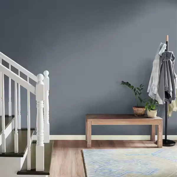
Why Swiss Coffee is a Great Choice:
- Swiss Coffee’s soft undertones add warmth, preventing the hallway from feeling cold or stark.
- It reflects light beautifully, making the space appear larger and more inviting.
- It works well on trim, wainscoting, and ceilings to complement Midnight Blue without overpowering it.
Pro Tips:
- Use Swiss Coffee for hallway doors and moldings to create a classic contrast.
- Incorporate light-colored artwork or wall sconces to break up the dark walls and add visual interest.
- Opt for soft lighting with warm LED bulbs to enhance the coziness of the space.
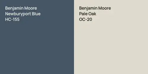
3. Benjamin Moore Hale Navy (HC-154) & Pale Oak (OC-20)
Benjamin Moore’s Hale Navy is a versatile and highly popular dark blue with a sophisticated, muted tone. It works well in both modern and traditional interiors. To prevent the hallway from feeling too dark, pair it with Pale Oak, a warm greige that offers a subtle contrast without feeling too stark.
Why Pale Oak Works Well:

Rust-Oleum 367605 Home Interior Floor Coating Kit, Semi-Gloss Black
Ideal for updating outdated flooring at a fraction of the cost of replacement and adheres without stripping, sanding or priming.
Buy Now on Amazon- Pale Oak has a slight gray-beige undertone, which softens the transition between Hale Navy and the rest of the space.
- It adds warmth while keeping the overall color palette neutral and sophisticated.
- It ensures the hallway remains open and inviting rather than overly shadowed.
Pro Tips:
- Use Pale Oak on adjacent walls if painting an accent wall in Hale Navy to maintain balance.
- Consider adding a patterned runner in light beige or gray to introduce texture and further lighten the space.
- Use wall mirrors strategically to reflect light and create the illusion of a wider hallway.
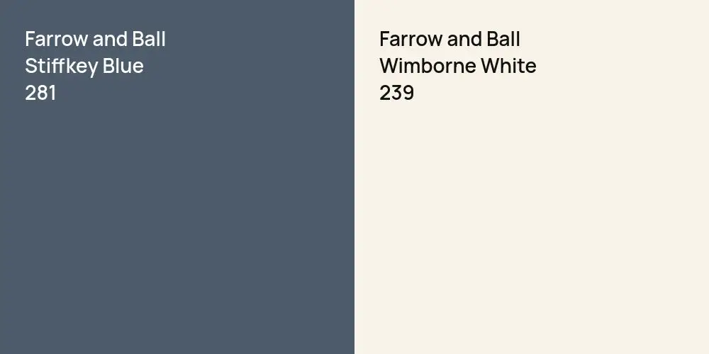
4. Farrow & Ball Stiffkey Blue & Wimborne White
Farrow & Ball’s Stiffkey Blue is a deep, inky blue with a historical and timeless appeal. While stunning, it can make a narrow hallway feel tight if used excessively. To counteract this, pair it with Wimborne White, a warm off-white that brings freshness and balance.
Why Wimborne White is a Perfect Pairing:
- It has a slight creaminess that prevents it from feeling too stark.
- The warm undertones of Wimborne White complement the richness of Stiffkey Blue.
- It works well on ceilings, moldings, and paneling to break up the intensity of dark walls.
Pro Tips:
- Use Stiffkey Blue on a feature wall or lower half of the walls with white wainscoting.
- Opt for light wooden furniture or console tables to add contrast and keep the space feeling open.
- Incorporate metallic accents, such as bronze or aged brass, to enhance the depth of the blue.
Final Thoughts & Additional Design Tips
- Lighting is key: Dark blue colors absorb light, so adding sconces, pendant lights, or recessed lighting can help illuminate the space.
- Break up dark tones with art and décor: Light-colored frames, artwork, or decorative elements can add brightness and visual interest.
- Consider flooring: If you have dark walls, a lighter floor (such as oak or beige tiles) can create balance and prevent the hallway from feeling enclosed.
- Mirrors are your friend: A well-placed mirror can reflect both natural and artificial light, helping to open up the space.
By carefully pairing dark blue with lighter, neutral tones, you can create a hallway that feels inviting, stylish, and well-balanced. Whether you choose Sherwin-Williams, Behr, Benjamin Moore, or Farrow & Ball, the right color combination can transform your hallway into a sophisticated and timeless space.