Choosing the perfect paint color can be one of the most rewarding—and daunting—parts of home design. Among the many options available, Sherwin Williams Sashay Sand (SW 6051) is quietly gaining popularity for its warm, sophisticated charm. If you’re looking for a hue that feels timeless yet modern, soft yet grounded, then Sashay Sand might just be your next go-to shade.
But is it the right fit for your space?
In this detailed review, we’ll explore everything you need to know about this beautiful paint—from undertones and lighting behavior to design pairings and expert tips. Whether you’re remodeling your living room, updating a guest bedroom, or planning a cohesive palette for your whole house, this guide will help you confidently decide.
What is Sherwin Williams Sashay Sand?
Quick Overview
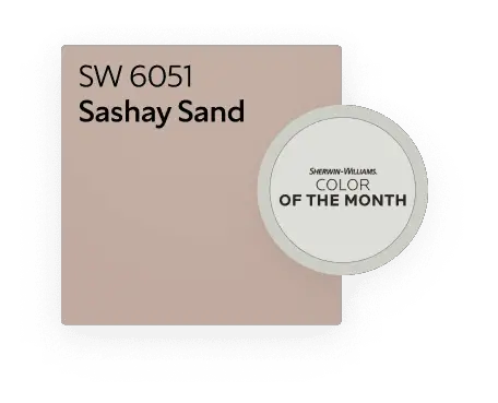
- Paint Name: Sashay Sand
- Color Code: SW 6051
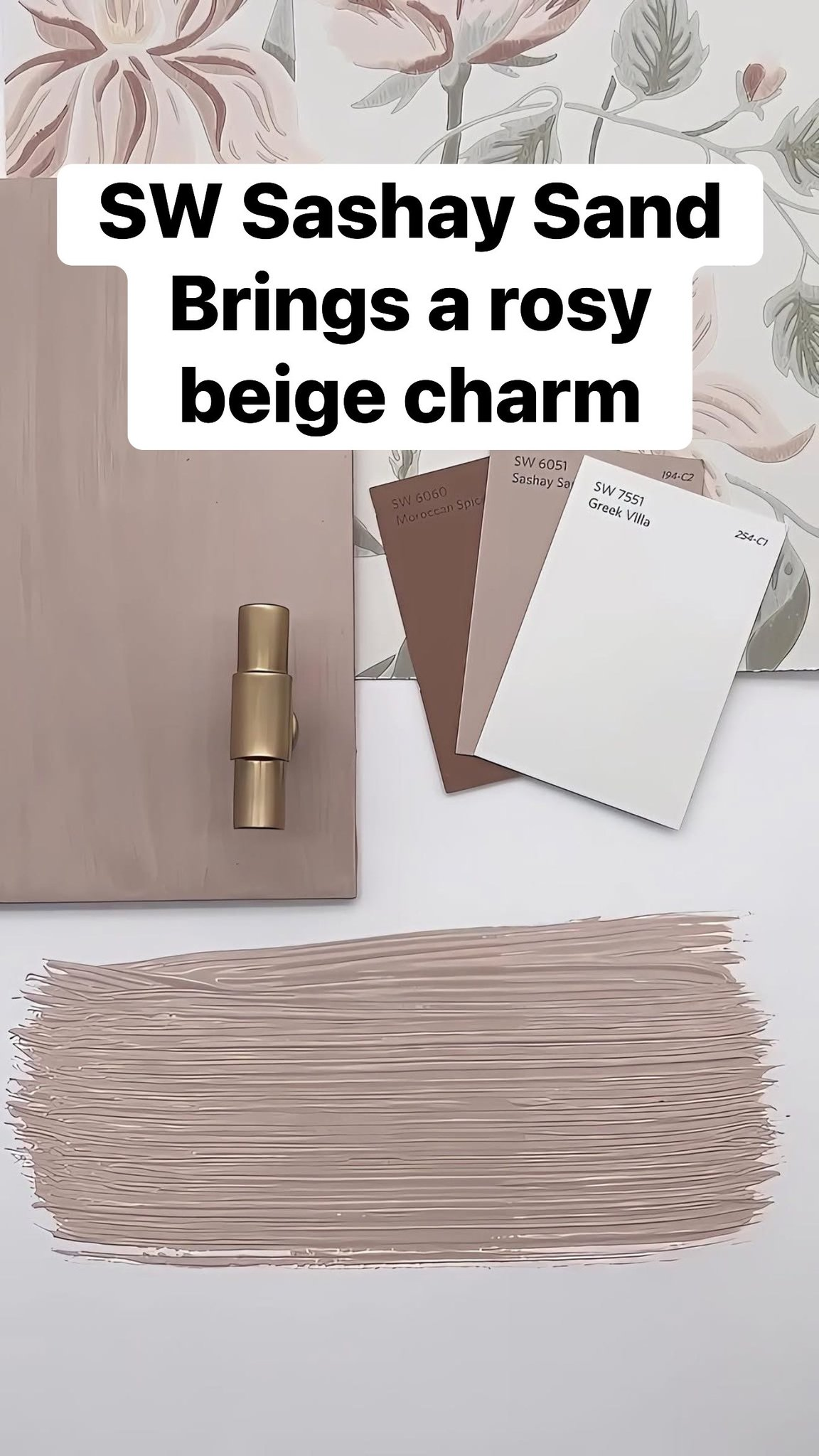
- LRV: 53
- Collection: Timeless Colors
Sherwin Williams describes Sashay Sand as a warm neutral with a soft rosy-beige undertone. It’s nestled somewhere between taupe, blush, and beige—creating a layered, cozy feel.
It’s not your typical beige, nor is it overly pink. That subtle complexity is exactly what makes it such a versatile choice for modern interiors.

Pro Grade Paint Roller Kit, Brush & Roller for Professionals & Homeowners
Perfect for smooth finishes on your interior walls. Ideal for home improvement enthusiasts!
Buy Now on Amazon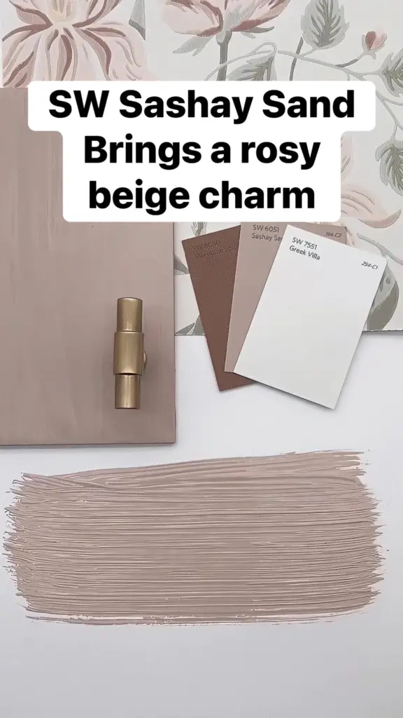
Color Code, Collection, and LRV Details
The LRV (Light Reflectance Value) of Sashay Sand is 53, putting it in the medium-light range. This means it reflects a moderate amount of light—not too dark and not too washed out—ideal for creating depth without making a room feel heavy.
Part of Sherwin Williams’ Timeless Colors Collection, this paint is designed to be both classic and adaptable—blending with changing trends and styles over time.
First Impressions – What Kind of Color is It?
At first glance, Sashay Sand might remind you of an aged terracotta, toned down with a hint of creamy beige. But under closer inspection, you’ll notice:
- A soft blush warmth
- A hint of dusty rose or clay
- A grounding beige foundation
It’s a “chameleon” color, often shifting depending on the lighting and surrounding colors in your space.

Rust-Oleum 367605 Home Interior Floor Coating Kit, Semi-Gloss Black
Ideal for updating outdated flooring at a fraction of the cost of replacement and adheres without stripping, sanding or priming.
Buy Now on Amazon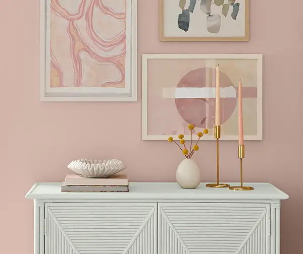
Warm or Cool? Understanding the Undertone
Sashay Sand is unquestionably warm, but not overly yellow or orange. Instead, it carries rosy-beige undertones, making it feel inviting, cozy, and calming. This warmth can be enhanced or muted depending on:
- Natural light in the room
- Wood tones or furniture
- Wall and trim pairings
If your space lacks warmth and feels stark, Sashay Sand can immediately soften and elevate it.
The Psychology Behind the Color
How Sashay Sand Makes You Feel
Color psychology plays a huge role in interior design. Sashay Sand evokes:
- Calmness and comfort, thanks to its soft, earthy quality
- Nostalgia, due to its vintage blush hints
- Sophistication, as it exudes quiet luxury rather than loud trendiness
This color doesn’t shout—it whispers elegance.
Emotional Triggers: Comfort, Calm, Sophistication
- Comfort: The gentle warmth of this shade can make even large, modern rooms feel cozy and personal.
- Calm: Unlike brighter tones that energize, Sashay Sand has a grounding effect.
- Sophistication: It’s elegant without being pretentious—ideal for homeowners who want subtle charm.
Where This Color Works Best Emotionally
Spaces where relaxation and warmth are a priority—like bedrooms, living rooms, and reading nooks—are perfect places for this hue.
Technical Aspects of Sashay Sand
LRV (Light Reflectance Value) Explained
With an LRV of 53, Sashay Sand reflects just over half the light that hits it. That gives it enough depth to make an impression while still being light enough to avoid making a room feel small.
Why it matters:
- In a north-facing room, it will appear slightly cooler and more muted.
- In a south-facing room, the warmth will shine through, giving it a beautiful glow.
How It Looks in Natural vs. Artificial Light
Natural Light:
- Morning light makes it appear slightly peachier
- Afternoon sun brings out the rosy beige tones
Artificial Light:
- Warm bulbs emphasize the cozy undertones
- Cool bulbs may mute it, making it appear grayer
It’s always a good idea to sample this color in different lighting conditions before painting the entire room.
Comparing It with Similar Shades
Let’s compare Sashay Sand to a few other popular shades:
| Paint Color | Description | Difference |
|---|---|---|
| SW Balanced Beige | Warm greige | Less pink, more neutral |
| SW Malted Milk | Pale peachy neutral | Lighter and more orange |
| BM Pale Oak | Cool beige | Less warm, more gray undertone |
If you love blush undertones and want something a bit deeper than white or greige, Sashay Sand is a fantastic middle ground.

Undertone Breakdown – Is That a Hint of Pink?
Yes—but it’s very subtle.
In certain lighting, Sashay Sand leans toward a muted dusty rose, which makes it a perfect companion for both cool and warm accent colors.
Sashay Sand in Different Spaces
Living Rooms – Cozy, Airy, and Inviting
Sashay Sand turns the living room into a haven. It pairs beautifully with:
- Creamy white trim
- Leather furniture
- Textured throws and woven rugs
Add in some brass accents or deep green plants for a truly curated vibe.
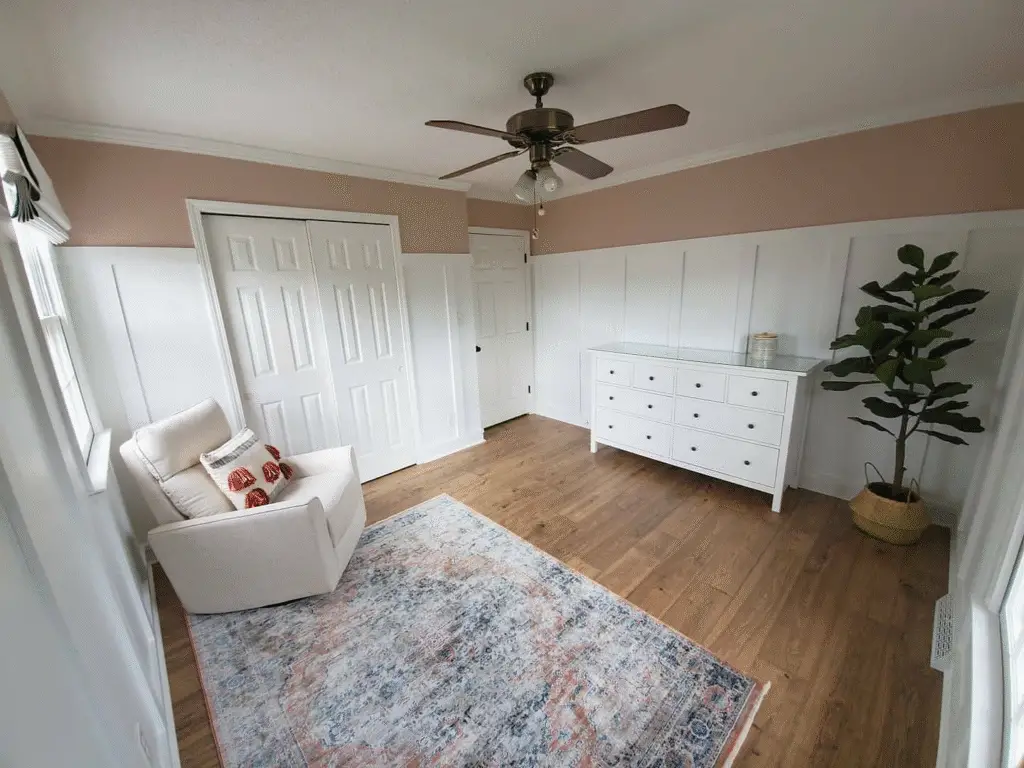
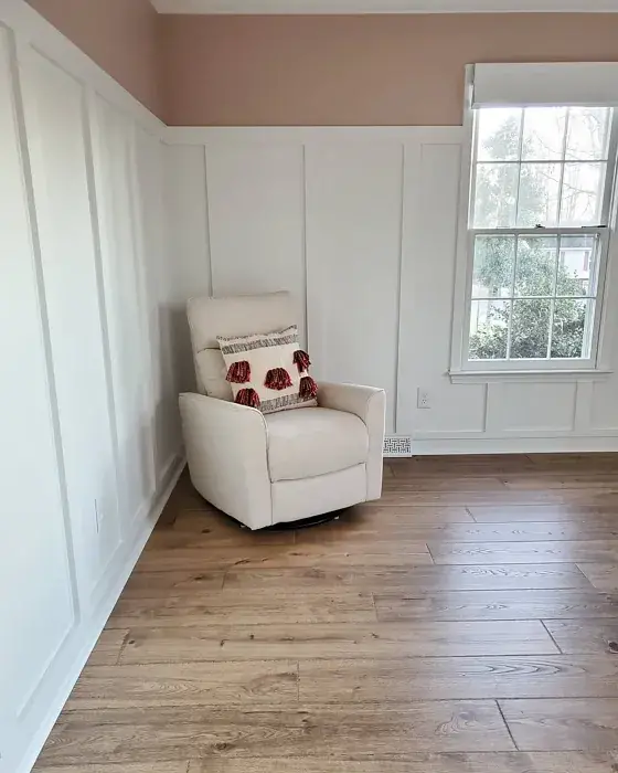
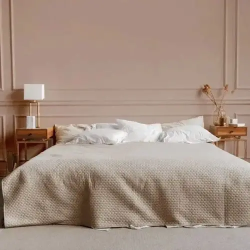
Bedrooms – Peaceful and Stylish Retreats
This is where Sashay Sand truly shines. It offers a calming palette that feels intimate and serene.
Pair it with:
- Crisp white or ivory bedding
- Velvet or linen textures
- Warm wood nightstands or rattan headboards
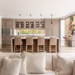
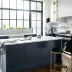
Kitchens – A Surprisingly Elegant Backdrop
You might not think of blush-beige for kitchens, but Sashay Sand offers warmth without overwhelming the space. Try it on:
- Walls with white or taupe cabinetry
- As a backdrop to floating wood shelves
- With brushed gold or matte black hardware
Bathrooms – Clean with a Hint of Luxe
In a bathroom, Sashay Sand feels spa-like. Paired with marble countertops or terrazzo tiles, it gives just the right hint of color.
Tip: Use it with satin or semi-gloss finish for easier cleaning and moisture resistance.
Hallways and Entryways – A Subtle Statement
In transitional spaces, Sashay Sand doesn’t overpower. It creates flow while adding enough depth to feel intentional.
Paint tip: Use a flat or eggshell finish for a more muted effect.
Ceilings and Trim – Yes, You Can Use It Creatively!
While many reserve bold colors for walls, Sashay Sand can be stunning on:
- A ceiling in a bedroom for a cozy “envelope” effect
- Interior doors for a designer-like twist
- Trim in a monochromatic scheme with slightly lighter or darker walls
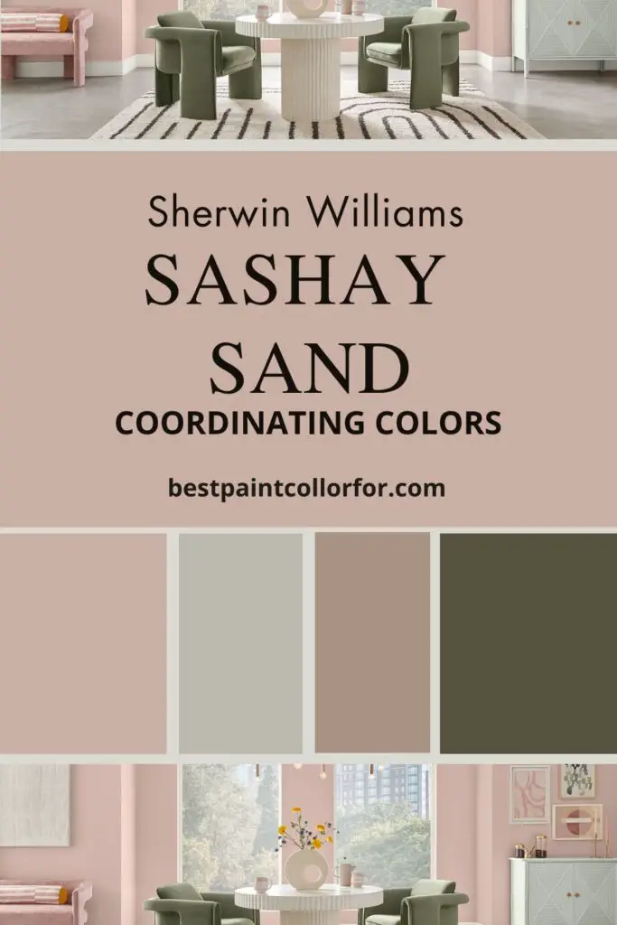
Best Coordinating Colors
Sashay Sand may look soft and subtle on its own, but the magic really happens when you pair it with the right complementary colors. Whether you’re building a whole-home palette or designing a single room, choosing coordinating shades can make or break the look.
Complementary Neutrals (White, Cream, Gray)
- Alabaster (SW 7008): A warm white that complements Sashay Sand beautifully, ideal for trims and ceilings.
- Shoji White (SW 7042): Slightly gray-cream that softens the transition between walls and woodwork.
- Agreeable Gray (SW 7029): A popular greige that works well in adjacent rooms or even on cabinetry.
These create a harmonious, layered effect without stealing attention.
Accent Colors That Pop
Looking to add contrast? These accents work wonders:
- Dusty Blue or Slate Blue – For a serene yet upscale vibe.
- Burnt Terracotta or Clay – To play off the rosy warmth and create depth.
- Charcoal Gray or Soft Black – For dramatic furniture or feature walls.
- Olive Green or Sage – Earthy, calming, and incredibly chic.
These combinations make the blush undertones in Sashay Sand come alive without looking forced.
Suggested Color Pairings by Sherwin Williams
Sherwin Williams often recommends curated palettes. Some go-to pairings for Sashay Sand include:
- Intimate White (SW 6322) – A pink-tinted neutral for soft transitions.
- Sunbleached Ochre (SW 9011) – A warm earthy shade for deeper contrast.
- Canvas Tan (SW 7531) – A neutral that blends easily with both pink and beige tones.
Coordinating with Wood Tones and Flooring
- Light Oak or Whitewashed Wood: Enhances the freshness and brightness.
- Walnut or Mahogany: Adds contrast and elevates the room’s sophistication.
- Gray-Washed Floors: Creates a calming, beachy atmosphere.
A helpful tip: lay down sample boards of paint next to your flooring to test real-world harmony.
Lighting Conditions and Sashay Sand
Lighting can make or break your experience with this paint color. Let’s break it down:
How it Appears in North-Facing Rooms
North-facing rooms tend to receive cooler, bluer light throughout the day. In these spaces:
- Sashay Sand may appear more muted
- Undertones lean beige rather than pink
- It might read more like a warm neutral taupe
Tip: Use warmer artificial lighting to bring back that soft, rosy charm.
South and West-Facing Room Dynamics
In south- and west-facing rooms, the light is warmer and more golden:
- Sashay Sand becomes more vibrant
- Blush tones are more noticeable
- It feels inviting and radiant
Perfect for bedrooms or family spaces where you want a cozy, “lived-in” feel.
The Role of Artificial Lighting
Warm Light Bulbs (2700K – 3000K):
- Boost the warmth
- Make the paint feel rich and velvety
Cool White Bulbs (4000K – 5000K):
- May wash out some of the undertones
- Could make it appear closer to beige-gray
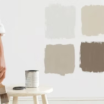
Tips for Testing Paint Before Committing
Never trust a swatch alone. Here’s how to test:
- Use peel-and-stick samples or paint small patches on multiple walls.
- Observe the color at different times of day.
- Look at it next to your floors, trim, and key furnishings.
(Related: [How to Find Paint Colors to Match Granite Countertops])
Real-Life Examples and Inspiration
Designer-Approved Rooms Using Sashay Sand
Interior designers love Sashay Sand for its understated elegance. It appears in:
- Modern farmhouse bedrooms with natural wood accents
- Transitional living rooms with brass lighting
- Small powder rooms where a bit of color goes a long way
Reader Showcase: Reader-Submitted Rooms
We’ve seen readers pair it with:
- Wicker and rattan furniture
- Jewel-tone pillows and drapes
- Vintage rugs with earthy pinks and taupes
Send us your own makeover photos—we’d love to feature you!
Pinterest & Instagram-Worthy Use Cases
Type #sashaysandpaint on Instagram, and you’ll find:
- Cozy nurseries with antique gold frames
- Open-concept spaces that flow from blush to greige
- Boho bedrooms with layered neutrals and pampas grass
Mood Boards and Sample Palettes
Try building a palette around Sashay Sand with:
- Trim: SW Alabaster
- Accent wall: SW Smoky Blue
- Furniture: Warm wood or white
- Textiles: Cream, blush, dusty rose, muted green
It’s a versatile base for both bold and minimalist design.
Paint Finish Options – What Works Best?
Matte vs. Satin – Which One for Which Room?
- Matte or Flat Finish – Great for low-traffic areas like bedrooms or studies. Hides wall imperfections beautifully.
- Satin Finish – Adds a hint of sheen. Perfect for living rooms, dining areas, or walls near windows.
Using Semi-Gloss on Trim with Sashay Sand Walls
Pairing Sashay Sand walls with semi-gloss white trim adds visual interest. It makes the soft color feel polished and defined—great for traditional or transitional interiors.
Tips for Choosing the Right Finish
- Use satin or eggshell in high-traffic spaces
- Reserve flat/matte for ceilings or formal areas
- Try semi-gloss or gloss on cabinetry, doors, and trim
Sashay Sand and Interior Design Styles
Modern Farmhouse
Sashay Sand is perfect for this style, adding softness to black metal fixtures, reclaimed wood, and shiplap.
Scandinavian Minimalism
Use it as a warmer backdrop than white. Add lots of texture—linen, birch wood, woven baskets—for a cozy, hygge-inspired space.
Bohemian Chic
The blush undertone makes it a dreamy match for plants, colorful textiles, vintage finds, and layered patterns.
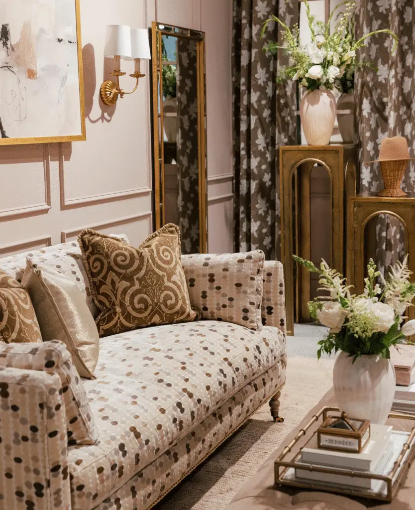
Traditional Elegance
Pair with ornate moldings, heavy drapes, and antique furniture. Think modern Victorian with an updated twist.
Coastal and Beach-Inspired Homes
Sashay Sand can replace sterile whites. It works great with:
- Woven textures
- Soft blues and greens
- Driftwood tones
Pros and Cons of Sashay Sand
Pros – Versatility, Warmth, Timeless Appeal
- Works across styles (from modern to rustic)
- Adds warmth without being overly pink
- Sophisticated, timeless aesthetic
Cons – Might Look Dull in Low Light, Undertone Sensitivity
- Can appear beige or washed out in low-light rooms
- Undertone may clash with strong yellows or cool grays
- Needs careful lighting consideration
Situations Where It May Not Work
- Industrial-style spaces that rely on cold, stark contrasts
- Rooms with blue or green-tinted lighting
- Ultra-modern designs demanding crisp, sharp hues
How to Use Sashay Sand Like a Designer
Want your space to look like it came straight out of a magazine spread? Let’s dive into how interior designers are using Sashay Sand to craft balanced, intentional, and eye-catching rooms.
Layering with Textiles and Decor
Because Sashay Sand is soft and neutral, it serves as a perfect canvas for layering:
- Textiles: Think chunky knit throws, linen curtains, velvet cushions
- Rugs: Try vintage or faded Persian rugs with subtle pinks, rusts, and creams
- Bedding: White and beige bed linens create a calming contrast
Balancing Neutrals and Accent Pieces
Pair Sashay Sand with:
- Creams and whites to keep things airy
- Deep browns or charcoals for grounded elegance
- Pops of navy, green, or mustard for added dimension
Balance is everything—this color plays well with contrast as long as undertones are considered.
Mixing Metals – Gold, Black, or Chrome?
Here’s what works best:
- Gold/Brass: For warm, luxe vibes (especially with blush tones)
- Matte Black: Bold and modern contrast
- Brushed Nickel or Chrome: Clean, transitional style
Pro Tip: Stick to one dominant metal, then introduce a secondary in small doses.
Flooring and Furniture Coordination Tips
Sashay Sand looks amazing with:
- Light or honey oak flooring for brightness
- Dark hardwoods for dramatic warmth
- Warm-toned area rugs to tie it all together
For furniture, think:
- White or cream sofas
- Natural wood coffee tables
- Textured baskets and wall art
Frequently Asked Questions (FAQ)
Is Sashay Sand a Beige or a Taupe?
Technically, it’s closer to a blush-beige—but with just enough depth to flirt with taupe. It has soft pink undertones that set it apart from traditional beige.
Will It Work with Gray Floors?
Yes, but make sure the gray leans warm or neutral. Cool, icy grays may clash slightly with the warmth of Sashay Sand.
(Related: [10 Paint Colors That Pair Well with Gray Floors])
Is It Good for Small Spaces?
Absolutely! The mid-level LRV (53) provides light without overwhelming the eye. Just make sure there’s enough natural or warm artificial light to keep it from feeling flat.
Can I Use It on Cabinets or Furniture?
Yes! It’s a great color for:
- Bedroom dressers
- Bathroom vanities
- Built-in shelves
Pair with gold or matte black hardware for an elevated look.
How to Touch It Up Without Color Mismatch?
Like most paints, Sashay Sand may change slightly with age and light exposure. To avoid mismatches:
- Use leftover paint from the original can
- Apply touch-ups with a foam brush or roller
- Feather edges for seamless blending
Common Mistakes to Avoid
Ignoring Lighting When Choosing This Color
Lighting will drastically change how this color looks. Always test it in:
- Morning and afternoon light
- Artificial lighting at night
- Different wall angles and elevations
Using the Wrong Finish
Too much sheen can highlight imperfections. For most walls:
- Eggshell or satin is ideal
- Avoid high gloss unless using it on trim or cabinetry
Pairing with the Wrong Trim Colors
Pure stark white trim can make Sashay Sand look dingy. Stick with:
- Alabaster
- Greek Villa
- Shoji White
These warmer whites enhance the rosy tones in a flattering way.
Not Sampling Before Painting Entire Room
This is the biggest mistake! Always:
- Test in at least 3 spots
- Use large swatches or peel-and-stick samples
- View during different times of day
(Related: [How to Sample Paint Like a Pro])
How to Sample Sashay Sand the Smart Way
Peel-and-Stick vs. Paint Sample Jars
Peel-and-stick samples (like Samplize):
- Clean, easy, removable
- No mess or clean-up
Paint sample jars:
- Let you see how the paint behaves with your roller or brush
- Can be tested on multiple materials (wood, drywall, etc.)
Where to Apply Samples
- At eye level in both shadow and direct light
- Across different walls in the room
- Near floors, trim, and major furniture pieces
Comparing with Other Shades in Your Home
Before committing, compare Sashay Sand next to:
- Other neutrals in your palette
- Existing furniture or rugs
- Cabinetry, if not repainting
Alternatives to Sherwin Williams Sashay Sand
If you love the feel of Sashay Sand but want to explore a few other options, here are some beautiful alternatives:
Similar Sherwin Williams Shades
- Malted Milk (SW 6057): A softer, peachier version
- Redend Point (SW 9081): Earthier and more brown-toned (2023 Color of the Year)
- Felted Wool (SW 9171): Cooler with subtle violet-gray undertones
Comparable Benjamin Moore Colors
- Pink Damask (OC-72): A warm blush-white with elegance
- First Light (2102-70): Lighter and airier, but still warm
- Pale Oak: More greige, less pink
What to Try if You Want Something Warmer/Cooler
- Warmer? Try SW Spun Sugar or SW Warm Beige
- Cooler? Try SW Egret White or SW Modern Gray
Is It Worth It? Final Verdict on Sashay Sand
So—is Sashay Sand worth the hype?
Yes—if you want:
- A warm, elegant neutral with subtle personality
- A color that works across styles (traditional, boho, modern)
- A gentle rosy-beige that feels timeless but unique
No—if you want:
- A crisp, modern white or gray palette
- Cool, minimalistic Scandinavian tones
- Highly saturated or high-contrast drama
Ultimately, Sashay Sand is a gentle nudge toward coziness and calm. It’s a color that invites you in, warms up a space, and adds an element of quiet luxury without trying too hard.
Conclusion
Sherwin Williams Sashay Sand is more than just a paint color—it’s a feeling. A whisper of blush, a hint of warmth, and a backdrop that supports a wide variety of design styles. Whether you’re painting one room or designing your whole home, this shade deserves a closer look.
Remember: sample before you commit, consider your lighting, and don’t be afraid to pair it with bold or muted accents. This is a color that rewards thoughtful design.