Welcome to this blog on home office paint colors—one of the most overlooked yet powerful factors in creating a productive and inspiring workspace right at home.
Have you ever walked into a room and instantly felt energized, calm, or even distracted? That’s the power of color. The shades you surround yourself with can shape your mood, influence your focus, and even impact your efficiency. And when it comes to designing a home office, choosing the right paint color isn’t just about aesthetics—it’s about setting the tone for how you work and feel every day.
In today’s world, home offices have evolved far beyond a simple desk in the corner where you check emails or make the occasional call. For many, it’s a dedicated space where deep focus, creativity, and productivity thrive. Whether you’re an entrepreneur, a remote worker, or just someone who needs a quiet place to think, the colors you choose can make all the difference.
In this post, we’ll dive into the fascinating world of color psychology and uncover how different hues can transform your workspace. From calming neutrals to energizing blues, I’ll help you find the perfect shade to keep you motivated and inspired.
Let’s get started! 🎨✨

Pro Grade Paint Roller Kit, Brush & Roller for Professionals & Homeowners
Perfect for smooth finishes on your interior walls. Ideal for home improvement enthusiasts!
Buy Now on Amazon
How to Choose the Best Color for a Home Office?
The big question is: how do you determine the perfect shade for your home office? Here are a few key factors to consider when selecting a color that enhances both productivity and comfort.
1. Purpose of Your Home Office
Before picking a color, think about what you use your home office for. If your work involves creativity and brainstorming, vibrant hues like yellow or orange can stimulate innovative thinking. On the other hand, if you need a calming space for deep focus, cooler tones like blue or green may be more beneficial.
2. Size of the Workspace
A small office can feel more open and airy with lighter shades, whereas larger rooms allow for more flexibility with darker colors. If your workspace is compact, opt for whites, soft neutrals, or pastels to make it appear bigger and brighter.
3. Lighting Considerations
Natural and artificial lighting impact how colors appear. Bright natural light can make lighter shades look washed out and intensify deeper colors. Before deciding on a hue, observe how much sunlight your office gets throughout the day.

Rust-Oleum 367605 Home Interior Floor Coating Kit, Semi-Gloss Black
Ideal for updating outdated flooring at a fraction of the cost of replacement and adheres without stripping, sanding or priming.
Buy Now on Amazon4. Personal Preference
At the end of the day, your workspace should reflect your personality. Colors influence emotions differently for each individual, so choose a shade that makes you feel comfortable, motivated, and at ease.
By considering these factors, you’ll be able to pinpoint the best home office paint color that aligns with your specific needs.
Helpful Tip
Online visualization tools like Sherwin-Williams’ ColorSnap Visualizer can be a great way to test different colors before making a final decision!
The Purpose of Your Home Office
The Purpose of Your Home Office
Every home office serves a unique function, depending on your profession, work style, and personal goals. Understanding the purpose of your workspace will help you choose a color that enhances your productivity and mood.
1. Calm and Focused Work Environment
If your job requires long hours of concentration and precision, opt for soothing colors. Soft blues, muted greens, and gentle grays promote tranquility, helping you stay focused without unnecessary distractions.
2. Creative and Energetic Workspace
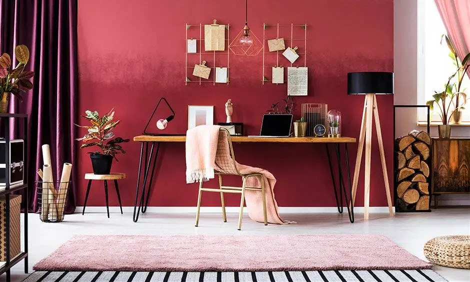
For those in artistic or brainstorming-heavy fields, bold and stimulating colors can spark fresh ideas. Vibrant yellows, energetic oranges, or rich purples can ignite creativity and keep your mind engaged.
3. Hybrid Work and Multi-Use Spaces
Does your home office double as a personal reading nook, hobby room, or meeting space? If so, a versatile neutral palette might be the best choice. Earthy browns, warm taupes, and elegant grays can seamlessly transition between professional and personal use.
20 Best Home Office Paint Colors for Productivity and Style
A well-chosen paint color can set the tone for productivity, creativity, and comfort in your home office. Whether you prefer soothing neutrals or inspiring shades, here are 20 of the best home office paint colors to transform your workspace.
1. Benjamin Moore Revere Pewter HC-172
A warm, light gray with subtle beige undertones, Revere Pewter creates a welcoming yet professional atmosphere. It balances warmth and neutrality, making it an excellent choice for any office style.
Features and Benefits:
- Timeless and versatile neutral tone
- Works well in natural and artificial lighting
- Pairs beautifully with wood tones and white trim
Pro Tips:
- Use it with white furniture for a modern look
- Pair with navy blue or charcoal accents for a sophisticated feel
2. Sherwin Williams Agreeable Gray SW 7029
This greige tone is a favorite for its adaptability. Agreeable Gray blends warm and cool tones, ensuring a calm yet energetic workspace that pairs well with various decor styles.
Features and Benefits:
- A perfect blend of gray and beige for balance
- Works well in different lighting conditions
- Enhances small spaces by making them feel larger
Pro Tips:
- Pair with dark wood or white furniture for a contemporary feel
- Add black hardware or fixtures for contrast
3. Benjamin Moore Hale Navy HC-154
A deep, bold navy blue, Hale Navy promotes focus while adding sophistication to your home office. It pairs beautifully with crisp whites and metallic accents.
Features and Benefits:
- Boosts concentration and depth in a workspace
- Ideal for accent walls or full-room applications
- Pairs well with warm metallics like brass or gold
Pro Tips:
- Use white or light-colored furniture to create balance
- Pair with warm lighting to soften the intensity
4. Sherwin Williams Naval SW 6244
Similar to Hale Navy but with a slightly cooler undertone, Naval exudes confidence and stability. It’s a perfect backdrop for a stylish, executive home office.
Features and Benefits:
- Evokes a sense of calm and reliability
- Works well in both modern and traditional office settings
- Enhances wood and leather furniture beautifully
Pro Tips:
- Use it with light-colored ceilings to prevent the space from feeling too dark
- Pair with gold or brass decor for a touch of elegance
5. Benjamin Moore Chantilly Lace OC-65
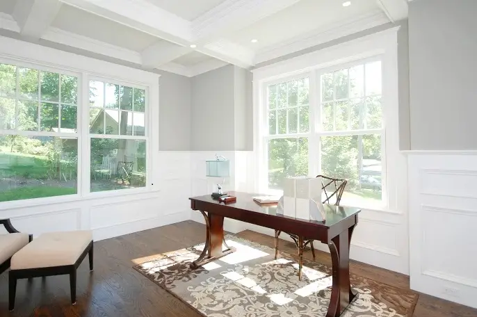
For those who love a clean, bright office, Chantilly Lace is an ultra-white shade that enhances natural light and makes a space feel open and airy.
Features and Benefits:
- Maximizes light reflection for an airy feel
- Creates a blank canvas for decor flexibility
- Pairs well with both warm and cool tones
Pro Tips:
- Use contrasting furniture or bold artwork to prevent a sterile look
- Ideal for small home offices to create a spacious feel
6. Sherwin Williams Accessible Beige SW 7036
A warm beige with a hint of gray, Accessible Beige keeps your office feeling cozy and inviting without overwhelming the space.
Features and Benefits:
- Soft, warm, and neutral for a comfortable workspace
- Complements both modern and rustic decor
- Pairs beautifully with natural wood tones
Pro Tips:
- Combine with navy blue or deep green for added contrast
- Use with matte black decor for a sophisticated touch
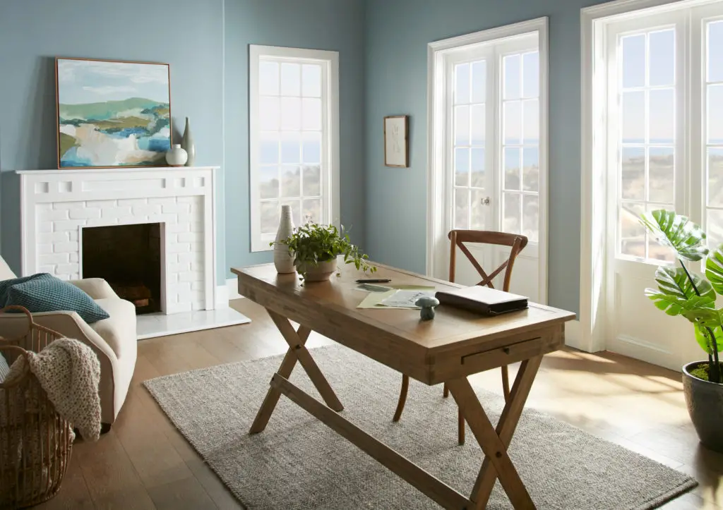
7. Benjamin Moore Palladian Blue HC-144
A soft, muted blue-green, Palladian Blue creates a calming and refreshing atmosphere, perfect for reducing stress while working.
Features and Benefits:
- Soft and serene, promoting relaxation and focus
- Works well in both natural and artificial lighting
- Complements white and light wood furniture beautifully
Pro Tips:
- Pair with white trim and natural textures for a coastal feel
- Use soft gold or brass accents to add warmth
Insights:
This shade is perfect for those who want a balance between productivity and tranquility. It works particularly well in smaller home offices to create a sense of openness.
8. Sherwin Williams Sea Salt SW 6204
A misty blue-green with subtle gray undertones, Sea Salt evokes a spa-like calmness, ideal for reducing work-related stress.
Features and Benefits:
- Creates a soothing and refreshing work environment
- Adjusts in different lighting, appearing more blue or green
- Works well with natural wood, white, and light gray decor
Pro Tips:
- Best paired with soft white trim for a clean, airy look
- Ideal for home offices with lots of natural light to enhance its shifting tones
Insights:
Sea Salt is great for those who want a relaxed yet professional setting. It helps prevent mental fatigue, making it ideal for long work hours.
9. Benjamin Moore Edgecomb Gray HC-173
A warm, soft greige that adapts beautifully to any lighting, Edgecomb Gray creates a cozy yet sophisticated work environment.
Features and Benefits:
- Perfect balance of gray and beige for a warm neutral tone
- Enhances both traditional and modern decor styles
- Works well in varying lighting conditions without looking too dark
Pro Tips:
- Pair with crisp white trim for a clean, fresh look
- Use with natural wood furniture to bring out its warm undertones
Insights:
This shade is ideal for those who want a timeless, adaptable color that promotes focus while maintaining a cozy feel.
10. Sherwin Williams Alabaster SW 7008
A soft, warm white that’s neither too stark nor too yellow, Alabaster offers a clean yet inviting aesthetic.
Features and Benefits:
- Brightens up spaces without feeling cold or sterile
- Works well in both traditional and modern offices
- Complements bold accent colors beautifully
Pro Tips:
- Pair with darker accent walls or furniture to add depth
- Works beautifully with natural lighting for a warm, glowing effect
Insights:
Alabaster is perfect for those who want a fresh, minimalist workspace that allows furniture and decor to stand out.
11. Benjamin Moore Coventry Gray HC-169
A cool, sophisticated gray with blue undertones, Coventry Gray creates a professional and elegant workspace.
Features and Benefits:
- Modern and sleek, ideal for executive-style home offices
- Pairs well with navy blue, white, and metallic accents
- Enhances productivity with a calming yet authoritative tone
Pro Tips:
- Use with high-contrast trim (white or black) for a striking look
- Ideal for home offices with modern furniture and sleek finishes
Insights:
This color is excellent for those who want a refined, polished workspace that fosters deep focus and creativity.
12. Sherwin Williams Evergreen Fog SW 9130
A deep green-gray, Evergreen Fog offers an earthy, organic feel while maintaining a modern, elegant aesthetic.
Features and Benefits:
- Creates a grounded, nature-inspired workspace
- Works well with natural wood and neutral furnishings
- Muted yet rich, preventing distractions while working
Pro Tips:
- Combine with warm metallics like brass or copper for sophistication
- Pairs beautifully with cream or beige for a balanced look
Insights:
If you enjoy an environment that feels close to nature, this shade enhances creativity and reduces mental fatigue.
13. Benjamin Moore White Dove OC-17
A warm, soft white, White Dove is a go-to color for those who love a classic, timeless home office.
Features and Benefits:
- Adds warmth without appearing too yellow or stark
- Enhances natural light, making small spaces feel larger
- Pairs well with wood tones, soft grays, and navy accents
Pro Tips:
- Use with matte black fixtures for a contemporary contrast
- Great for offices with traditional or transitional decor
Insights:
This shade is perfect for those who want a clean, refined workspace that feels open and inviting.
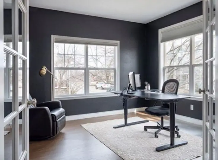
14. Sherwin Williams Iron Ore SW 7069
A deep, almost-black charcoal gray, Iron Ore creates a bold and sophisticated statement for a dramatic office setup.
Features and Benefits:
- Provides a sleek, modern look with high contrast
- Works well with white, wood, and metallic elements
- Perfect for accent walls or full-room applications in larger spaces
Pro Tips:
- Pair with warm wood tones for a rich, cozy feel
- Use plenty of lighting to balance out the depth of the shade
Insights:
Iron Ore is ideal for those who want a workspace with a powerful, executive presence. It’s a great option for moody, high-end office aesthetics.
15. Benjamin Moore Kendall Charcoal HC-166
A deep, warm charcoal gray, Kendall Charcoal brings elegance and depth to a workspace while remaining versatile.
Features and Benefits:
- Creates a cozy yet professional feel
- Works well with white, wood, and muted accent colors
- Adds depth without overwhelming the space
Pro Tips:
- Use with light wood furniture to maintain warmth
- Pairs beautifully with deep greens or blues for an upscale look
Insights:
This color is perfect for those who want a sophisticated yet inviting office. It adds richness while keeping the space grounded and focused.
16. Benjamin Moore Gray Owl OC-52
A light gray with soft green undertones, Gray Owl offers a crisp, modern look without feeling too cold. It’s a great choice for those who want a bright yet neutral workspace.
Features and Benefits:
- Cool and airy, perfect for small home offices
- Adapts well to different lighting conditions
- Works beautifully with both warm and cool decor
Pro Tips:
- Use with white trim for a fresh, clean aesthetic
- Pair with deep blue or green for a calming effect
17. Sherwin Williams Alabaster SW 7008
A soft, warm white that exudes elegance and tranquility, Alabaster is ideal for those who prefer a light and airy office without stark whiteness.
Features and Benefits:
- Enhances natural light to make spaces feel open
- Has subtle warmth for a cozy yet professional look
- Works well with earthy tones and pastel accents
Pro Tips:
- Combine with black hardware for a modern contrast
- Layer with textures like linen or wood for depth
18. Benjamin Moore Sea Salt 2137-60
A serene blend of gray and green, Sea Salt creates a refreshing and calming environment, ideal for reducing stress in your home office.
Features and Benefits:
- Soft green undertones for a tranquil feel
- Great for boosting focus and relaxation
- Works well in spaces with plenty of natural light
Pro Tips:
- Pair with warm wood tones for a natural aesthetic
- Add metallic decor for a sophisticated touch
19. Sherwin Williams Tricorn Black SW 6258
For a bold and dramatic office space, Tricorn Black makes a statement. This deep black shade is sleek, modern, and exudes confidence.
Features and Benefits:
- Adds depth and sophistication to any workspace
- Works well as an accent wall or full-room application
- Enhances metallic and wooden furnishings beautifully
Pro Tips:
- Pair with white or gold decor for high contrast
- Use with strategic lighting to prevent the room from feeling too dark
20. Benjamin Moore Palladian Blue HC-144
A blend of soft blue and green with a hint of gray, Palladian Blue is perfect for a refreshing yet professional workspace.
Features and Benefits:
- Encourages relaxation and creativity
- Adaptable to different decor styles
- Works well in rooms with moderate to high natural light
Pro Tips:
- Pair with warm woods for a coastal-inspired feel
- Use white trim and furniture for a fresh, airy look
Final Thoughts
Choosing the right paint color for your home office is about balancing style, mood, and productivity. Whether you prefer soothing neutrals, energizing blues, or earthy greens, these 20 shades will help you create a workspace that inspires success!