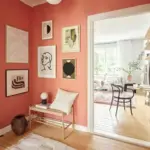
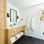
White, a timeless paint color, has been a classic choice for years.
However, if you’re aiming for a light and bright ambiance without the cold sterility, a warm off-white might be the ideal solution.
In this discussion, we delve into the popular warm off-white paint color, Sherwin Williams Egret White, and explore whether it could be the perfect choice for your home.
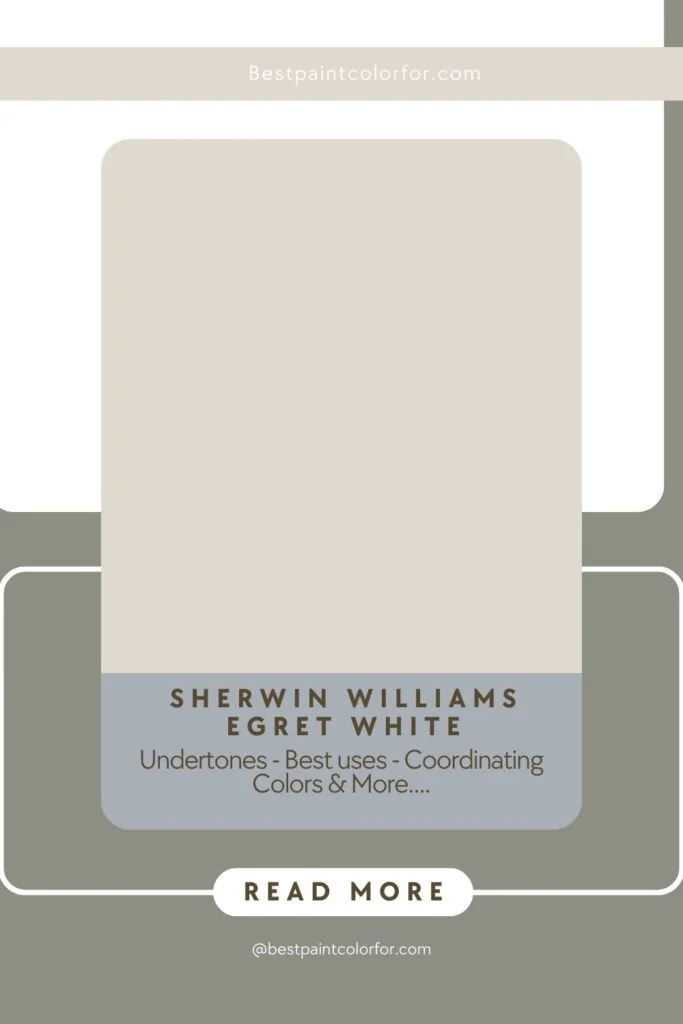
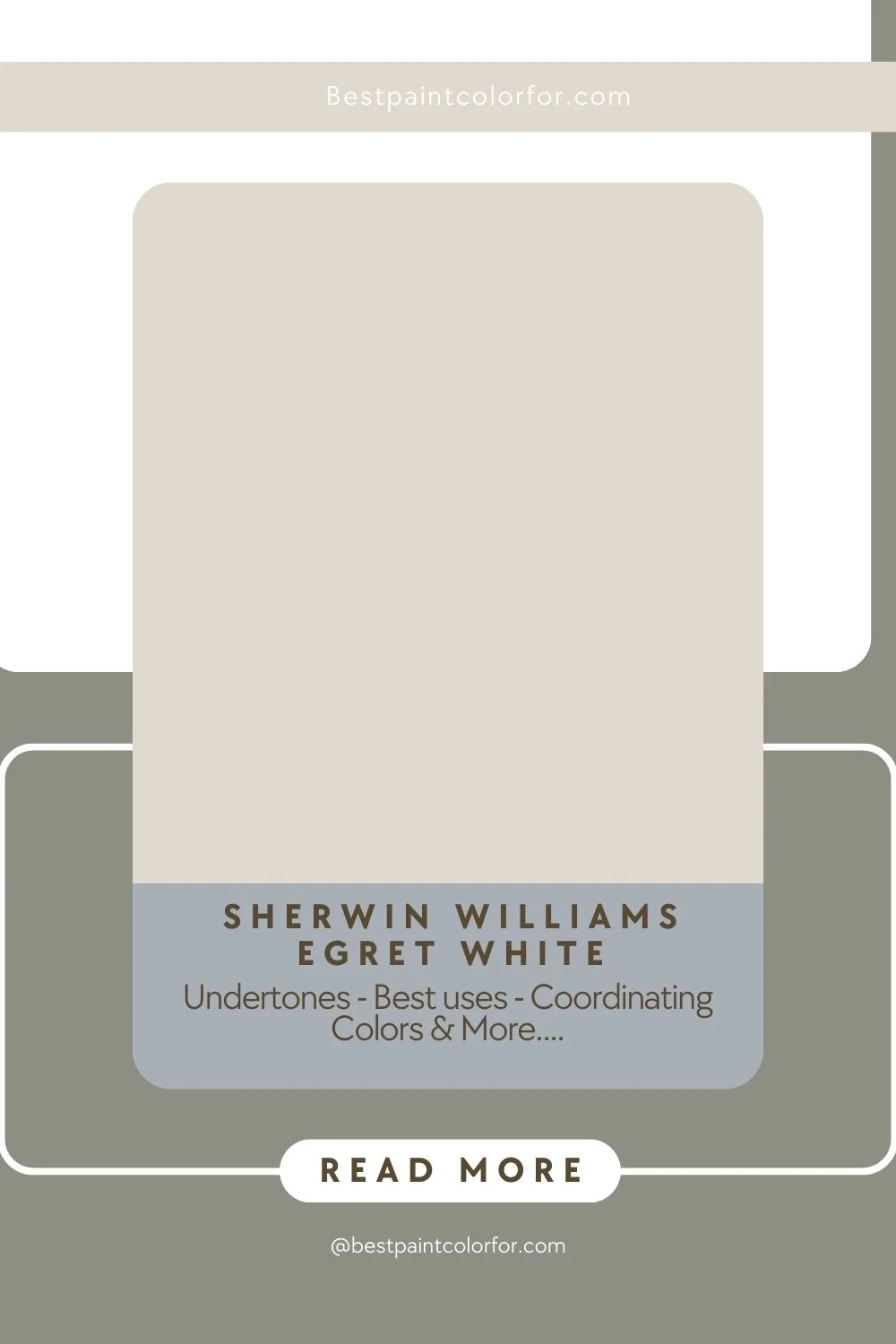
Understanding Sherwin Williams Egret White SW7570:
Sherwin Williams Egret White stands out as a warm neutral white paint color.
Featuring subtle purple or pink undertones, this color appears clean and neutral in bright, well-lit rooms.

Pro Grade Paint Roller Kit, Brush & Roller for Professionals & Homeowners
Perfect for smooth finishes on your interior walls. Ideal for home improvement enthusiasts!
Buy Now on AmazonWe’ll analyze its characteristics and suitability for various spaces.
Color Attributes:
- Color Family: Egret White falls into the warm off-white category.
- Light Reflectance Value (LRV): With an LRV of 70, Egret White leans more towards an off-white than a true white. This characteristic makes it suitable for very bright rooms.
- RGB Colors: Describing the mix of red, green, and blue, Egret White’s RGB values are R:223 G:217 B:207.
- Hex Code: The hex code for Egret White is #dfd9cf.
- Undertones: While neutral, Egret White has warm undertones, with a touch of purple and pink, especially noticeable when paired with green or yellow accent colors.
Best Uses of Egret White:
Egret White’s versatility allows it to serve as a whole-house paint color. However, it’s crucial to avoid using it in dark or north-facing rooms, where it might appear dingy in low light.
Exterior applications should be approached with caution, as sunlight may enhance its warmth, potentially creating confusion about its true color.
Sherwin Williams Egret White emerges as a chameleon in the realm of paint colors, showcasing unparalleled versatility that extends its application to serve as a whole-house paint color.
Rust-Oleum 367605 Home Interior Floor Coating Kit, Semi-Gloss Black
Ideal for updating outdated flooring at a fraction of the cost of replacement and adheres without stripping, sanding or priming.
Buy Now on AmazonThis warm off-white hue, nestled in the warm off-white color family, holds the promise of transforming interiors into spaces of timeless elegance and comfort.
Optimal Usage and Considerations:
While Egret White has the potential to illuminate and harmonize a home’s entire palette, strategic considerations are essential for unlocking its full potential.
Rooms basking in ample natural light, where brightness prevails, become the ideal canvas for this warm neutral white.
The clean and neutral appearance of Egret White shines brightest in well-lit spaces, creating an atmosphere of openness and tranquility.
Navigating Light Conditions:
However, like any paint color, Egret White is not immune to the influence of light conditions. Caution should be exercised in selecting this hue for spaces devoid of natural light or those facing the north. In such environments, Egret White might lose some of its brilliance, appearing slightly dingy and less luminous.
The nuanced interplay of light and color underscores the importance of understanding the specific characteristics of each room before committing to a whole-house application.
Exterior Caution:
Venturing beyond the confines of interiors, the prospect of using Egret White in exterior applications beckons consideration.
While the color’s warm neutrality is an asset indoors, the outdoor environment introduces a new set of variables.
Sunlight, in particular, can cast a transformative glow on exterior surfaces, potentially amplifying the warmth of Egret White.
This sunlight-induced enhancement could lead to a perceptual shift, causing a degree of confusion regarding the color’s true identity.
Balancing Warmth and Confusion:
The warmth inherent in Egret White, while inviting and cozy, requires a delicate balance when applied outdoors.
Homeowners must weigh the desire for a welcoming exterior against the potential for confusion arising from the interplay of sunlight and color warmth.
This duality prompts a thoughtful evaluation of the specific architectural elements, lighting conditions, and the overall desired aesthetic.
Sample Testing for Certainty:
In the quest for the perfect whole-house color, the significance of sample testing cannot be overstated.
Applying Egret White samples to different walls and observing them under various lighting conditions ensures a nuanced understanding of how the color behaves in the specific context of your home.
This empirical approach empowers homeowners to make informed decisions, mitigating the risk of surprises once the full application is underway.
Similar Colors:
Exploring shades like Sherwin Williams Windfresh White, City Loft, and coordinating with various whites, browns, blues, and greens, Egret White offers flexibility in color pairings.
From pure whites to warm browns and deep blues, this neutral hue complements a wide range of coordinating colors.
Sherwin Williams Windfresh White:
Sherwin Williams Windfresh White exudes a sense of freshness and purity. This crisp white paint color is a versatile choice, bringing a clean and airy ambiance to any space.
With its light and bright undertones, Windfresh White is perfect for those seeking a timeless and classic look, making it an ideal option for walls, trim, or even ceilings.
Sherwin Williams City Loft:
Sherwin Williams City Loft introduces a sophisticated and urban charm to interiors. This warm gray with subtle taupe undertones offers a neutral backdrop that pairs seamlessly with a variety of color schemes.
City Loft exudes a contemporary elegance, making it a popular choice for modern interiors where a balance of warmth and sophistication is desired.
Sherwin Williams Limewash:
Sherwin Williams Limewash is a unique and vibrant green that brings a touch of nature indoors. This lively color adds personality and energy to a space, making it a standout choice for accent walls or furniture.
Limewash is a refreshing departure from more conventional neutrals, offering a bold option for those looking to infuse their interiors with a sense of vitality and connection to the outdoors.
Valspar Puff:
Valspar Puff is a soft and delicate shade that whispers tranquility. This gentle off-white paint color creates a serene atmosphere, making it particularly well-suited for bedrooms, bathrooms, or any space where a calm and soothing ambiance is desired. Puff provides a subtle backdrop for other design elements to shine, contributing to an overall sense of relaxation and comfort.
Valspar Mink Frost:
Valspar Mink Frost introduces a touch of sophistication with its warm and muted brown tones. This rich and inviting color adds depth to a room, making it an excellent choice for spaces where a cozy and welcoming feel is desired.
Mink Frost can effortlessly complement both traditional and contemporary design styles, making it a versatile option for various interior applications.
Benjamin Moore Athena:
Benjamin Moore Athena is a graceful and muted gray with undertones of blue and green. This sophisticated color adds a touch of elegance to interiors, creating a serene and calming atmosphere.
Athena is an excellent choice for bedrooms or living spaces where a subtle and refined backdrop is desired, providing a timeless and enduring aesthetic.
Benjamin Moore Pale Oak:
Benjamin Moore Pale Oak is a soft and versatile neutral that effortlessly bridges the gap between warm and cool tones.
This warm taupe-gray offers a subtle backdrop that adapts to different lighting conditions. Pale Oak is an excellent choice for those seeking a harmonious and adaptable paint color that complements a wide range of design styles.
Behr Wintermoss:
Behr Wintermoss introduces a muted and tranquil green-gray to interiors. This subtle and sophisticated color adds a touch of nature without overwhelming the space.
Wintermoss is an ideal choice for creating a serene and inviting atmosphere, making it suitable for bedrooms, bathrooms, or any area where a calming influence is desired.
Behr Campfire Ash:
Behr Campfire Ash is a deep and warm charcoal gray with undertones of brown. This bold and dramatic color adds depth and richness to a room, making it a striking choice for accent walls or statement pieces of furniture.
Campfire Ash is perfect for those looking to create a cozy and intimate atmosphere, infusing a sense of warmth into their living spaces.
Coordinating Colors
Whites:
- In the realm of whites, Westhighland White stands out as a crisp and clean option, radiating purity and brightness throughout a space.
- Snowbound offers a softer, more muted alternative, creating a tranquil and serene atmosphere.
- Pure White, as its name suggests, embodies the essence of pristine whiteness, making it a versatile choice for those seeking a classic and timeless aesthetic.
- Whether used for walls, trim, or ceilings, these white shades contribute to an open and airy ambiance, allowing for endless design possibilities.
Browns:
- When it comes to browns, Palisade brings a warm and inviting tone, creating a cozy and comfortable feel in any room.
- Functional Gray offers a modern twist with its sophisticated gray-brown fusion, perfect for contemporary interiors.
- Alpaca, with its subtle taupe undertones, provides a neutral backdrop that complements various color schemes.
- Requisite Gray and Intellectual Gray add depth and richness to spaces, offering a range of brown hues that are versatile and adaptable to different design styles.
Blues and Greens:
- For those drawn to the soothing tones of blues and greens, Silken Peacock stands out with its vibrant and lively blue-green hue, injecting energy into interiors.
- Sea Salt offers a softer and more subdued option, reminiscent of the tranquil colors of the ocean, making it an excellent choice for creating a calming atmosphere.
- Smoky Blue introduces a touch of drama with its deep and mysterious blue, perfect for adding a sense of sophistication to accent walls or focal points.
- Rocky River brings a refreshing greenish-blue to the palette, providing a versatile and invigorating option. Moscow Night, a deep and intense navy blue, exudes elegance and timelessness, making it a captivating choice for creating a sense of drama and opulence in any space.
Trim Colors and Finishes:
Egret White can be used for both walls and trim, providing a soft, monochromatic look. Alternatively, for a modern, contrasting appearance, crisp clean whites such as Benjamin Moore Simply White or Sherwin Williams Extra White can be used for trim.
Egret White vs. Pale Oak:
Comparing Egret White with Pale Oak reveals two creamy off-white shades, both popular neutral paint color options. While they share similar darkness (LRV of 70) and fall into the warm, creamy, off-white category, their main difference lies in undertones. Egret White carries pink or purple undertones, while Pale Oak emanates warmth from yellow and golden tones.
Conclusion:
In conclusion, Sherwin Williams Egret White proves to be a versatile and warm off-white option for those seeking a light and bright interior.
Its undertones, best uses, and coordinating possibilities make it a contender for various design preferences.
As with any paint color selection, testing samples in your specific space is crucial to ensure the desired look and feel.
If you’re considering a warm white, Egret White might just be the perfect choice for your home.

